Most pages of logo examples are a wall of famous marks with a sentence each. You scroll, you nod, and you still don't know which kind of logo your own business should have, or why any of those marks ended up the way they did.
So I took a different route. On October 20, 2026, I read the brand's own history page, or a named press report, for 15 well-known logos and noted three things: what type of logo it is, the year that matters most in its story, and who made it. Nine of the 15 trace their core mark to before 1980, and two of the oldest were drawn by people inside the business, not hired designers.
Below you'll find the full table, the 15 logo examples sorted by the seven main logo types, what each one does well, and how to use them as samples for your own company logo.
What Are the Best Logo Examples?
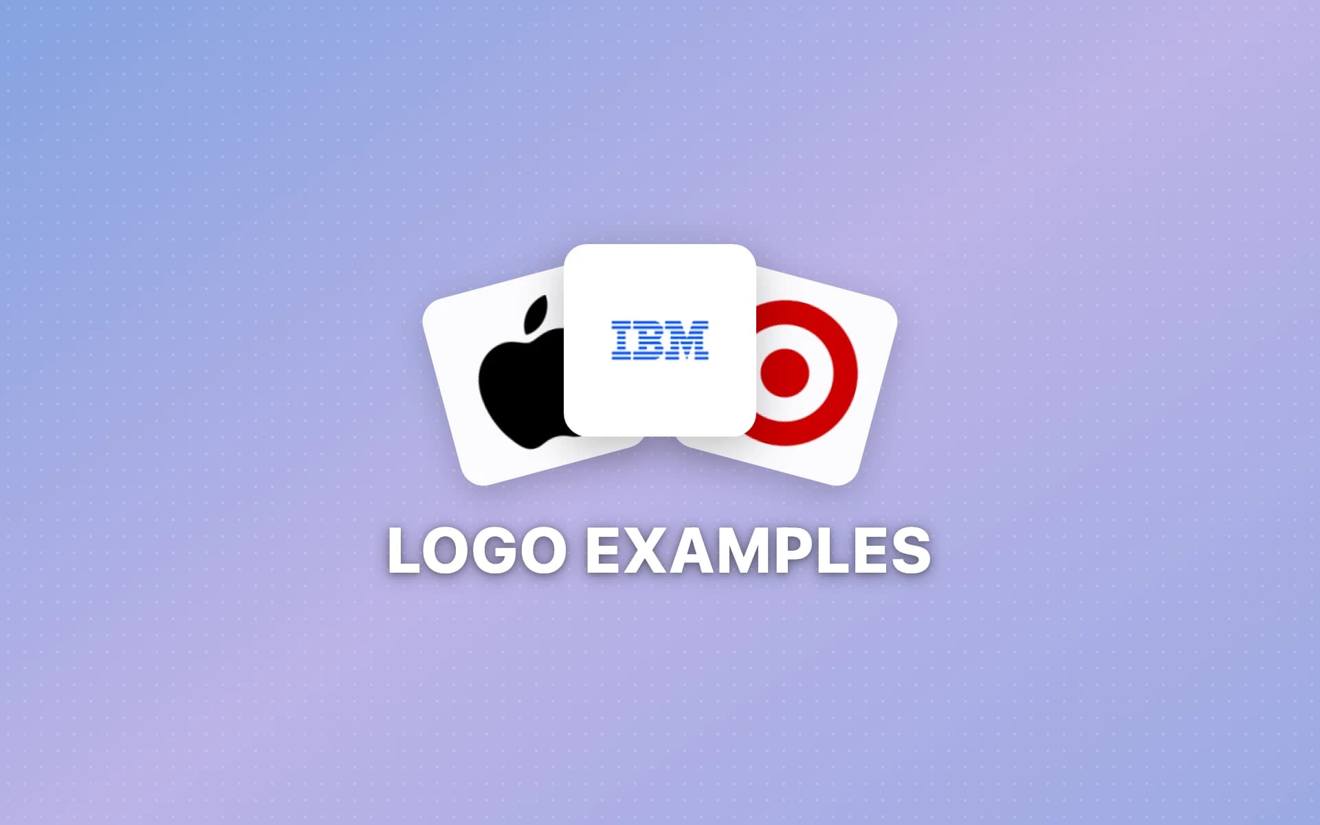
The best logo examples are marks like Coca-Cola's script, IBM's striped letters, Apple's bitten apple, Chase's octagon, the Michelin Man, the Starbucks siren and the Burger King bun. Each one is simple enough to recognize at a glance and has stayed close to its original idea for decades, which is what makes it worth studying.
15 Logo Examples at a Glance
Each row links to the source I used: the brand's own page where one exists, otherwise the agency that made it or a named publication.
| Logo | Type | Key year | What happened that year |
|---|---|---|---|
| Coca-Cola | Wordmark | 1886 | Bookkeeper Frank M. Robinson writes the name in Spencerian script |
| Wordmark | 2015 | New logo and identity built for small screens | |
| FedEx | Wordmark | 1994 | Landor's Lindon Leader finds the hidden arrow |
| IBM | Lettermark | 1972 | Paul Rand creates the 8-bar logo |
| Louis Vuitton | Monogram | 1896 | Georges Vuitton draws the LV canvas |
| Apple | Pictorial | 1977 | Rob Janoff adds the bite |
| Target | Pictorial | 1962 | First Bullseye logo, as the first store opens |
| Chase | Abstract | 1961 | Chermayeff & Geismar's blue octagon |
| Mastercard | Abstract | 2019 | The circles drop the name |
| Michelin | Mascot | 1898 | The tyre man raises a glass of nails |
| Mailchimp | Mascot | 2018 | Collins gives Freddie a new look |
| Starbucks | Emblem | 2011 | The siren loses the words "Starbucks Coffee" |
| BMW | Emblem | 1917 | The roundel is registered as a trademark |
| Burger King | Combination | 2021 | First rebrand in 20 years brings back the bun |
| Amazon | Combination | 1998 | Turner Duckworth takes the brief that leads to the smile |
A note on method: these are brand stories, not design rankings, and I left out marks whose dates I couldn't confirm from a reliable source.
What Are the 7 Types of Logos?
The seven main types of logos are wordmarks, lettermarks (or monograms), pictorial marks, abstract marks, mascots, emblems and combination marks. Wordmarks and lettermarks are built from type, pictorial and abstract marks are symbols with no words, mascots are characters, emblems put text inside a shape, and combination marks pair a symbol with the name.
The 15 logo examples below follow that order, two or three per type.
Wordmark Logo Examples
A wordmark is the brand name set in distinctive type, with no symbol. It's the most direct way to teach people your name. The wordmark logos guide covers the typography side in more depth.
1. Coca-Cola
When John S. Pemberton created his drink in 1886, his partner and bookkeeper, Frank M. Robinson, suggested the name, "thinking that 'the two Cs would look well in advertising,'" according to The Coca-Cola Company's trademark chronology. He then wrote it out in an adaptation of Spencerian script, the formal penmanship of the day.
Why it works: it started as handwriting, so it never looked like a stock font. The two capital Cs give it rhythm, which is exactly what Robinson was going for.
2. Google
On September 1, 2015, Google introduced "a new logo and identity family" designed to show "when the Google magic is working for you, even on the tiniest screens" (Google's blog). The same post retired the little blue "g" icon for a four-color "G" that matches the full logo.
That second move is the lesson. The colors carry the brand even when the word doesn't fit, so the wordmark can shrink to an app icon and still look like Google.
3. FedEx
Lindon Leader, then a senior design director at Landor Associates, designed the FedEx logo in 1994. His team produced more than 200 designs and narrowed them to six before the arrow showed up between the "E" and the "x," per Retail Brew.
The arrow sits in the negative space, so the name stays clean while the shape hints at direction. Leader called it a "hidden bonus": "Either you see it or you don't."
Lettermark and Monogram Logo Examples
A lettermark uses a brand's initials instead of its full name. It's the go-to fix for long or hard-to-say names. See the monogram logos guide for ways to arrange the letters.
4. IBM
IBM's own history page says Paul Rand "created IBM's now instantly recognizable 8-bar logo in 1972," with "the three letters of the company name rendered in eight (and sometimes 13) horizontal lines" (IBM). The same page lists six earlier logos, going back to 1888.
Why it works: three short letters are easy to read, and the stripes turn them into a pattern nobody else owns.
5. Louis Vuitton
According to Monte Cristo Magazine's history of the monogram, Georges Vuitton drew the logo himself in 1896 and created the LV canvas to honor the memory of his father. Next to the initials, the canvas carries three alternating geometric flowers. Repeated across a trunk or a bag, the initials turn the product itself into the logo.
Pictorial Logo Examples
A pictorial mark is a recognizable picture: an apple, a target, a bird. It's memorable, but a new brand usually pairs it with the name until people connect the two.
6. Apple
Rob Janoff designed Apple's logo in 1977. He told Logo Design Love that the bite was practical: "to make it look more like an apple and not some other round fruit, I took a bite out of it." The original rainbow stripes were meant "to make a computer seem friendly enough to bring home for the whole family to use."
Why it works: the bite solves a real problem (a plain circle could be a cherry), and it gives the silhouette a shape you can spot from across a room.
7. Target
Target's first store opened on May 1, 1962, in Roseville, Minnesota. Stewart K. Widdess and his staff "considered more than 200 potential names," and "the first Bullseye logo was used from 1962 until it was streamlined in 1968 by removing one of the red concentric circles" (Target).
Why it works: the picture is the name. A bullseye says "Target" before you read anything, and the 1968 change shows that removing a ring made it stronger, not weaker.
Abstract Logo Examples
An abstract mark is a shape that doesn't depict anything literal. It gives a brand room to grow into its symbol. The abstract logos guide has tips on making one feel intentional, and Nike's Swoosh, covered in the sportswear logo roundup, is the best-known example.
8. Chase
Chermayeff & Geismar & Haviv has designed the blue octagon "since 1961." The studio says the mark "was inspired by a traditional Chinese coin, and, with the square enclosed in an octagon, it suggests a bank vault" (Chermayeff & Geismar & Haviv). It also notes that "at the time, few American corporations used abstract symbols."
Why it works: it's abstract but not random. A shape with a quiet meaning (security, a vault) is easier to defend in a meeting and easier to remember than pure decoration.
9. Mastercard
In January 2019, Mastercard stopped using its name beneath the red and yellow circles in many places. Dezeen reported the company's finding that "more than three quarters of people asked were able to identify the brand from the two interlocking circles alone." Pentagram had already redrawn the circles in 2016, and Pentagram partner Michael Bierut said the change put Mastercard among brands "represented not by name, but by symbol" (Dezeen).
Why it works: two overlapping circles are about as simple as a mark gets. The name came off only after the company had evidence people knew the shape.
Mascot Logo Examples
A mascot logo is a character that stands for the brand. It brings personality and gives a company a face, which helps when the product itself is hard to picture.
10. Michelin
At the 1894 exposition in Lyon, Édouard and André Michelin spotted a pile of tyres that looked like an armless figure. The poster that followed, by cartoonist Marius Rossillon, was used "largely unchanged from 1898 well into the 1910s," and showed the character "holding aloft a glass full of nails and other detritus" under the slogan "Nunc est Bibendum" ("now we must drink"), per Hagerty.
The clever part is that the character is made of the product. A mascot built from a stack of tyres explains the business without a single word.
11. Mailchimp
Mailchimp's brand page says: "We always pair our company name with the Freddie icon. And Freddie's always winking because he has a great attitude" (Mailchimp). In September 2018, the studio Collins gave Freddie "a slick new look," replaced the hand-drawn wordmark and moved the brand to Cavendish Yellow (Creative Review).
Why it works: one small quirk, the wink, sets the tone for the whole brand. A mascot doesn't need much detail if its attitude is clear.
Emblem Logo Examples
An emblem puts the name or initials inside a shape, usually a badge or a circle. It reads as established and looks at home on a storefront sign. The retro logos guide shows how vintage badges stay readable.
12. Starbucks
In January 2011, Starbucks removed "the words 'Starbucks Coffee'" from its logo and kept a close-up of its twin-tailed siren, which had appeared since the first Seattle store opened in 1971 (Nation's Restaurant News). Howard Schultz said the change let the siren "come out of the circle in a way that I think gives us the freedom and flexibility to think beyond coffee."
Why it works: the circle and the siren were familiar enough to carry the brand alone, so the words could go. The logo mark explainer looks at when a symbol is ready to stand without the name.
13. BMW
BMW's roundel was registered in the German Imperial Register of Trademarks on October 5, 1917. It kept the round shape of its predecessor, Rapp, and its blue and white quarters are Bavaria's colors in reverse order, because trademark law at the time banned state symbols on commercial logos (The Drive). The propeller story came from a 1929 ad. BMW Group Classic's Fred Jakobs told The Drive, "Many people believe the BMW logo is a stylized propeller. But the truth is a little different." Myth or not, a ring of letters around a simple colored center is easy to stamp onto a car badge, and it still reads at small sizes.
Combination Mark Logo Examples
A combination mark pairs a symbol with the brand name in a fixed layout. It's the safest choice for most new businesses, because the name teaches people what the symbol means.
14. Burger King
In January 2021, Burger King unveiled its first rebrand in 20 years, by the agency Jones Knowles Ritchie. Dezeen called it a "simplified logo": it shows "two bun halves sandwiching the words Burger King," and it pays homage to the logos "used by the brand throughout the 1970s, 80s and 90s," replacing the version introduced in 1999 (Dezeen).
Why it works: the bun turns the name into a burger. It's a combination mark where the symbol and the words can't be pulled apart, which makes it hard to forget.
15. Amazon
Turner Duckworth, the agency behind the Amazon smile, writes: "In 1998 we took a brief from Jeff Bezos." The result: "The once generic line became a simple arrow curved into the shape of a smile," and that arrow could "show, quite literally, that they sold everything from A to Z" (Turner Duckworth). One curved line does two jobs, and it sits under the name without crowding it.
What These 15 Logo Examples Have in Common
Lined up in the table, the 15 marks show a few clear patterns.
- Most are old. Nine of the 15 trace their core mark to before 1980: Coca-Cola (1886), Louis Vuitton (1896), Michelin (1898), BMW (1917), Chase (1961), Target (1962), the Starbucks siren (1971, though its table year is the 2011 change), IBM (1972) and Apple (1977). A good idea can run for a century.
- Recent changes lean simpler. Of the five changes after 2010 in the list, three made the logo simpler: Starbucks and Mastercard dropped words, and Burger King moved to what Dezeen called a "simplified logo."
- Insiders drew some of the best. Coca-Cola's script came from the company's bookkeeper, and the LV canvas from the founder's son. You don't need an agency to land a lasting idea, though FedEx, Chase and Amazon show what a good one adds.
- The idea is often practical. Apple's bite tells you it's an apple, Target's bullseye spells out the name, and the Michelin Man is made of tyres. A logo that solves a real problem tends to stick.
- Symbols go solo only after the name has done its job. Starbucks had used its siren for 40 years before it dropped the words, and Mastercard waited for proof that people knew the circles.
Business Logo Examples: Which Type Fits Your Company?
The right logo type depends on your name and where the logo will live. Short, distinctive names suit wordmarks. Long names suit lettermarks. Brands that need a small icon for apps and social profiles benefit from a symbol, usually paired with the name at first as a combination mark.
Here's how the company logo samples above map to common situations:
| Your situation | Logo type to consider | Example from this list |
|---|---|---|
| Short, unusual name | Wordmark | Google, FedEx |
| Long or hard-to-say name | Lettermark or monogram | IBM |
| Name that's also a picture | Pictorial mark | Apple, Target |
| Bank, tech or B2B brand | Abstract or combination mark | Chase, Mastercard |
| Friendly consumer brand | Mascot | Mailchimp, Michelin |
| Café, food or heritage brand | Emblem or combination mark | Starbucks, Burger King |
If you're starting from scratch, the modern logos guide and the minimalist logos guide are good places to see how clean geometry keeps a business logo flexible.
What Makes a Good Logo?
A good logo is simple enough to recognize at a glance and still works in one color at tiny sizes. It also carries one clear idea tied to the brand. The 15 logo examples here all pass those tests: none needs a gradient or fine detail to work, and most can be drawn from memory.
A quick test you can run on your own design:
- Shrink it. View it at favicon size. If it turns into a blob, cut detail.
- Drop the color. Print it in black. If it stops making sense, the color is doing too much work.
- Describe it in five words. "Bitten apple." "Blue octagon." "Bun around the name." If you need a paragraph, it's too complicated.
- Check the background. It has to sit on light and dark surfaces. The transparent logo guide shows how to export a version with no background box.
How to Turn These Logo Samples Into Your Own
Use logo examples to pick a type and a principle, not a shape. Copying the look of a famous mark gets you a weaker version of someone else's brand, and possibly a trademark problem.
- Settle the name first. A logo built around a name you later change is wasted work. The business name generator helps you collect options.
- Choose the type. Use the table above. If you're unsure, start with a combination mark.
- Borrow the principle. Take the idea behind an example ("the picture is the name," "one hidden detail," "the product is the mascot") and apply it to your own business.
- Pick two or three colors. The color palette generator gives you a starting set from a single keyword.
- Sketch several directions. Look at many options before you commit to one, and browse the logo types if you want to compare styles side by side.
- Check for lookalikes. Search the USPTO trademark database before you print anything.
If you'd like to see a batch of directions quickly, LogoGen is one option: you describe your company with its name and a short description, pick a style and colors, and it generates logo options, typically in under 10 seconds.
Frequently Asked Questions
What is the most recognizable logo in the world?
There's no single official ranking, so treat any "most recognizable" list with care. Mastercard has one of the few published data points: the company found that more than three quarters of people asked could identify it from the two circles alone, as Dezeen reported in 2019.
What are some good business logo examples for a small company?
Look at combination marks like Burger King and Amazon, because they pair a simple symbol with the name, which suits a business people don't know yet. Wordmarks like Google and FedEx work if your name is short. Lettermarks like IBM help if it's long. Pick the type first, then study examples of that type.
Where can I find logo samples by style?
Sort examples by logo type, as this page does, so you compare like with like. A wordmark should be judged against other wordmarks, not against a mascot. Brand guideline pages, like IBM's logo history or Mailchimp's brand assets page, are also good samples, because they show how a company actually uses its logo.
Should my logo include my company name?
Usually, yes, at least at first. Starbucks had used its siren for 40 years before it dropped the words "Starbucks Coffee" in 2011, and Mastercard removed its name only after research showed people recognized the circles. A new business needs the name on the logo to teach people what the symbol stands for.
Can I copy a famous logo for my business?
No. Famous logos are registered trademarks, and a design that looks similar can get you into legal trouble even if you changed some details. Use famous logo examples for principles, like simplicity or a hidden detail, then search the USPTO database for similar marks before you use your design.