Logo vocabulary is a mess. One designer says "logo mark," another says "brand mark," a third says "symbol," and the brand guide you just downloaded calls the same thing a "glyph." If you're trying to brief a designer or just figure out what you actually need, that's confusing.
So here's the plain version of what a logo mark is, how it differs from a full logo, and how it sits next to wordmarks, lettermarks and combination marks. I also read the official logo guidelines of 10 companies on October 18, 2026, to see what real brands call their symbol and when they let it appear without the name. Only 5 of the 10 use the word "logomark."
What Is a Logo Mark?
A logo mark (also written logomark, and often called a brand mark or symbol) is the graphic part of a logo with no words in it. It's a shape, icon or picture that stands for the brand on its own, like Nike's Swoosh or Apple's apple. Wordmarks and lettermarks, by contrast, are built from type.
That's the whole definition. The tricky part is how the term gets used, because most companies don't have just one logo. They have a set: the symbol, the name set in custom type, and a lockup that puts the two together.
Logo Mark vs Logo: What’s the Difference?
A logo is the full identifier a brand uses, which can be words, a picture or both. A logo mark is only the picture. Every logo mark is a logo, but plenty of logos have no mark at all.
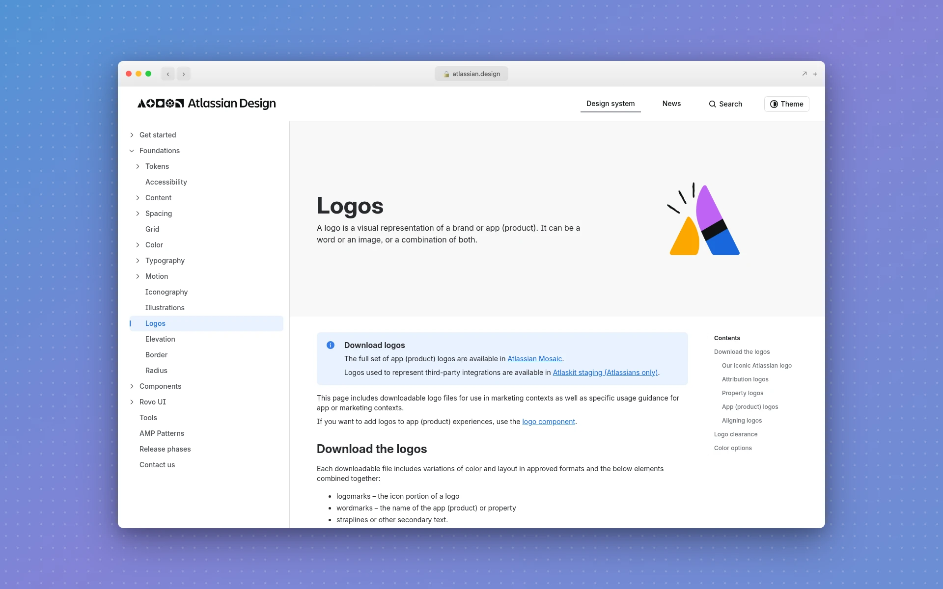
Atlassian's design system puts it neatly. It defines a logo as "a visual representation of a brand or app (product). It can be a word or an image, or a combination of both," and calls logomarks "the icon portion of a logo" (Atlassian Design System). The name part gets its own term: the wordmark.
In practice, people say "logo" when they mean whatever sits in the corner of the website. Designers get more specific because the parts behave differently:
- The logo mark has to work at tiny sizes, like a favicon or an app icon.
- The wordmark carries the name, so it's what builds recognition early on. See the wordmark logos guide for how those are built.
- The lockup (or combination mark) pairs the two in a fixed arrangement for headers, packaging and documents.
What 10 Brands Call Their Logo Mark
Here's what I found when I read 10 official brand and logo guideline pages on October 18, 2026. I noted the exact word each page uses for the standalone symbol, and whether it limits when the symbol can appear without the name.
| Brand | What the guide calls the symbol | Limits on using it alone |
|---|---|---|
| Atlassian | Logomark | None found on the page |
| Linear | Logomark | Yes: for "tight layouts or logo-only grids" |
| Mindbody | Logomark | Yes: "app and social icons, or when space is extremely limited" |
| Softr | Logomark | None found on the page |
| Sarvam | Logomark | Yes: "where the Sarvam brand is already established" |
| GitHub | Invertocat, its "logo pictogram" | Yes: where "the brand is already clearly established" |
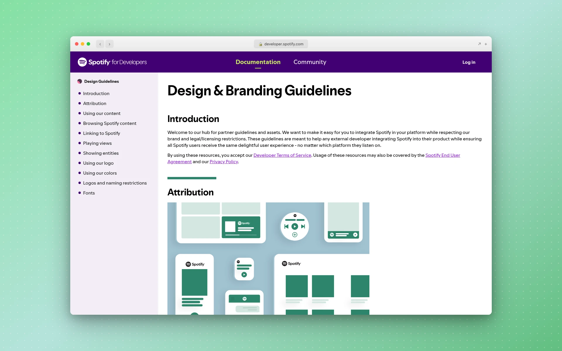
| Spotify | Icon | Yes: "Only use it if you do not have enough room for the full logo" |
| Dropbox | Glyph | None found on the page |
| Meta | Symbol (used in its sizing rule) | None found on the page |
| Figma | No separate term | Not applicable |
A few patterns stand out:
- "Logomark" is the most common term, but it's not universal. Half the pages use it. The rest say icon, glyph, pictogram or symbol, or skip naming it.
- "Wordmark" is close to universal. Nine of the 10 pages use "wordmark" or "word mark" for the name. Meta was the one that didn't.
- Half of them put limits on the symbol. Five guides restrict the standalone symbol to cramped spaces or places where people already know the brand.
That third point matters most if you're building a brand from scratch. GitHub and Spotify both have well-known symbols, and both still default to the version with the name.
The Other Logo Types, Explained
The logo mark is one of several logo types. Here's how the cluster of terms fits together.
What Is a Brand Mark?
A brand mark is another name for a logo mark: a symbol or graphic that represents the brand without any text. Designers use the two terms interchangeably, and you'll also see "pictorial mark" for a recognizable image (an apple, a bird) versus an "abstract mark" for a shape that doesn't depict anything.
Abstract marks get their own treatment in the abstract logos guide. They're harder to read on day one but give a brand room to grow into the shape.
What Is a Combination Mark?
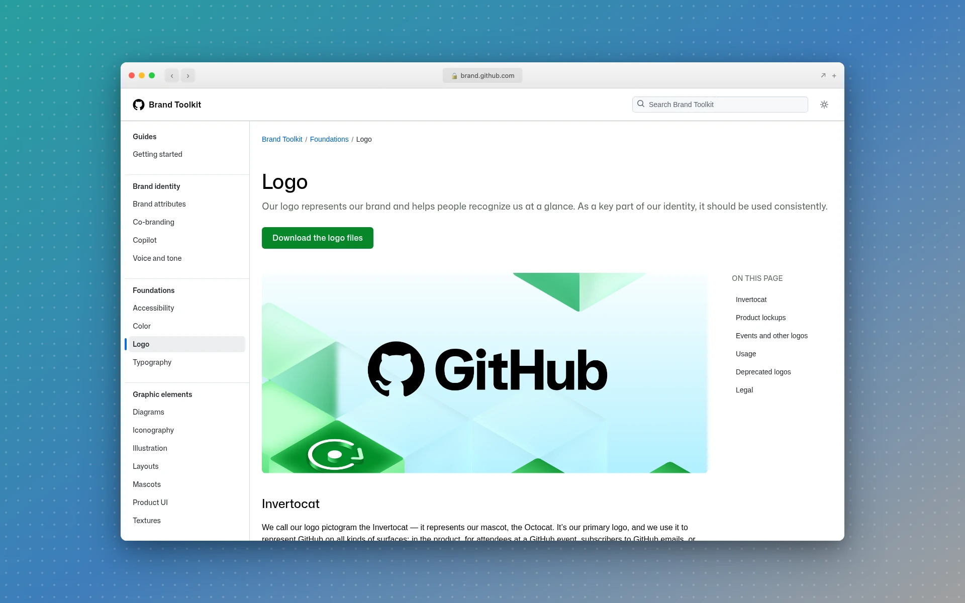
A combination mark is a logo that pairs a symbol with the brand's name in one fixed design. Several brand guides, including GitHub's and Mindbody's, call this the "lockup." GitHub's guide says it uses "the lockup, featuring the invertocat and wordmark, in most places," and Spotify describes its full logo as "the combination of a wordmark with our icon."
Combination marks are the safest choice for a new business. The name teaches people what the symbol means, and you can still pull the symbol out later for small spaces.
What Is a Lettermark?
A lettermark is a logo made from a brand's initials, set in distinctive type. Think IBM, HP or CNN. It's typography, not a picture, so it isn't a logo mark in the strict sense, though people often lump them together.
Lettermarks are also called monograms, and they're handy when a full name is long or hard to say. The monogram logos guide covers how to arrange the letters so they read at a glance.
What About Wordmarks?
A wordmark is the full brand name set in custom or heavily styled type, with no symbol. Google, Coca-Cola and FedEx are the classic examples. If your name is short and distinctive, a wordmark alone might be all you need for years.
When Should You Use a Logo Mark on Its Own?
Use a logo mark alone when space is tight or when your audience already knows the brand. App icons, favicons, social media avatars and product UI are the usual spots. Everywhere else, the guides I read lean on the full lockup or the wordmark.
Famous symbols got there at very different speeds. Nike's Swoosh was designed in 1971 by Carolyn Davidson, a Portland State University design student whom Phil Knight hired at $2 an hour, and she was paid $35 for it. According to Nike's own history of the logo, the Swoosh first appeared alone on a garment in 1974, on a tracksuit Steve Prefontaine wore at a meet in Tacoma.
Starbucks took much longer. In January 2011 it went wordless, dropping the words "Starbucks Coffee" from its logo and keeping only the siren. Howard Schultz said the change let the siren "come out of the circle in a way that I think gives us the freedom and flexibility to think beyond coffee" (Nation's Restaurant News). That was 40 years after the first store opened in Seattle.
The takeaway for a new business: design a mark, but pair it with your name until people recognize it without help.
How to Design a Logo Mark That Holds Up
A logo mark lives in harder conditions than any other part of your identity. Here's what tends to separate one that works from one that doesn't.
- Test it at 16 pixels. If it turns into a blob at favicon size, simplify it. Fine lines and small gaps are usually the first things to go.
- Check it in one color. Your mark will end up on a black-and-white invoice or embroidered on a shirt. The minimalist logos guide has good advice on stripping a design to its essentials.
- Pick one idea. A mark that tries to show your product, your values and your city at once usually shows none of them clearly.
- Choose shapes on purpose. Rounded forms tend to read as friendly and sharp angles as energetic. The modern logos guide walks through how clean geometry keeps a mark versatile.
- Settle the colors early. If you don't have a palette yet, the color palette generator gives you a starting set from a single keyword.
- Make sure the name is settled first. A mark designed around a name you later change is wasted work. If you're still deciding, try the business name generator before you brief anyone.
One more thing: check that your mark doesn't look like someone else's. The US Patent and Trademark Office says a trademark "can be any word, phrase, symbol, design, or a combination of these things that identifies your goods or services" (USPTO), so a symbol can be protected on its own, and you can run into someone else's.
Frequently Asked Questions
Is a logo mark the same as a brand mark?
Yes, in everyday use. Both mean the symbol or graphic part of a logo with no text. Some designers use "brand mark" more broadly for any element that identifies the brand, but when someone asks for a brand mark, they almost always mean a standalone symbol like Apple's apple.
What's the difference between a logomark and a logotype?
A logomark is a picture or shape. A logotype is the brand name set in a specific typeface, which most guides now call a wordmark. Many brands use both, together as a lockup and separately when space demands it. Dropbox, for example, describes its logo as two elements: "the glyph and the word mark."
Should a new business use a logo mark alone?
Usually not at first. A symbol only works without the name once people have seen the two together many times. Start with a combination mark, and use the symbol on its own for app icons, favicons and social avatars. Five of the 10 brand guides I checked limit the standalone mark to small spaces or places where the brand is already known.
Can you trademark a logo mark separately from the name?
You can. In the US, a design can be registered as a trademark on its own, and a name and a stylized logo are commonly filed as separate applications so each part is protected independently. Rules and fees vary, so check with the USPTO or a trademark attorney before you file.
What are some famous logo mark examples?
Nike's Swoosh, Apple's apple, the Starbucks siren, GitHub's Invertocat and Twitter's old bird are well-known examples. Each one is recognizable with no name attached, which is the real test of a logo mark.
Where to Go From Here
A logo mark is the symbol, a wordmark is the name, and a combination mark is both together. Most businesses need all three eventually, but the order matters: settle the name, pair it with a simple mark, and let the mark earn its solo appearances.
If you want to see a few directions before committing to one, LogoGen is one option: you describe your business, pick a style and colors, and it generates logo options, typically in under 10 seconds. Or browse all the logo types to see which style fits your brand.