You've picked a blue you love, and now you're staring at a color picker wondering what goes with it. Then you open a famous company's brand guide and find dozens of swatches. So how many colors should a brand have, really?
Design blogs mostly say three to five. Big brand guides seem to say the opposite, so I went and counted.
On November 4, 2026, I read the official color pages of 10 brands and noted how many colors each one lists, and how many it treats as the core. The totals ran from 2 to 34. But 8 of the 9 guides that rank their colors keep the core at four or fewer. That short core is the part worth copying.
How Many Colors Should a Brand Have?
Most brands should have three to five colors: one or two main colors, one or two accents, and a neutral or two for text and backgrounds. A small business can stop at three. Bigger palettes exist, but in the 10 brand guides I checked, they sit behind a small core.
That range isn't only my read. Todaymade's guide lands on "3 to 5 carefully chosen colors", and DesignCrowd says to keep it between "one to three primary colors" plus a few secondary ones. For digital design, the Nielsen Norman Group is stricter still: "Limit your palette to three colors," because fewer colors leave "less for users to consider."
What 10 Brand Guides Actually List
I only counted a brand's own guidelines, and I skipped color-code sites, because they often disagree with each other. Here's what each page showed on November 4, 2026. Tints don't count as extra colors here unless the guide lists them as swatches of their own.

| Brand | Core colors | Everything else | Total listed |
|---|---|---|---|
| Mailchimp | 1: Cavendish Yellow | 1 accent: Peppercorn | 2 named |
| Discord | No split | Blurple, Light Blurple, Black | 3 |
| Perforce | 3 | 2 secondary, 1 neutral | 6 |
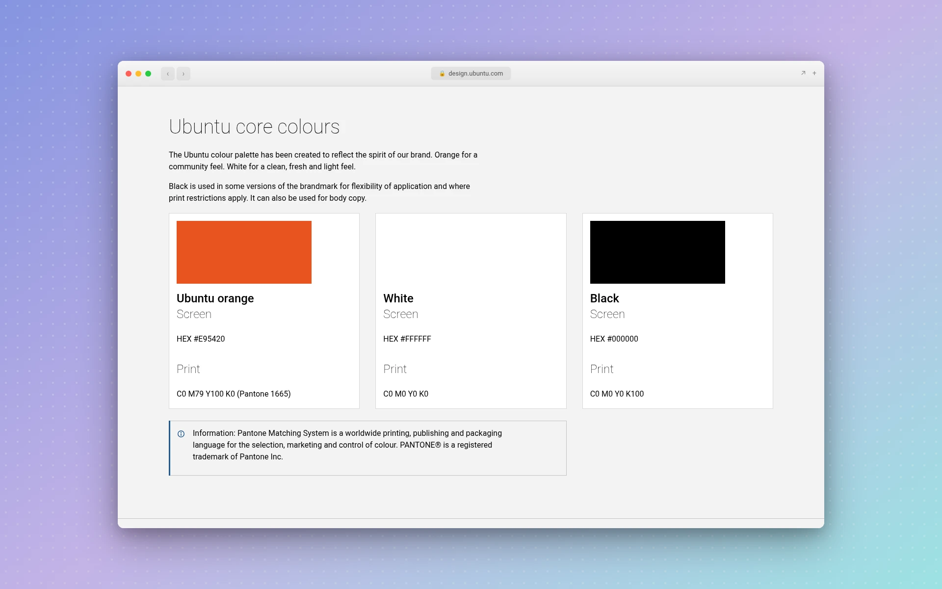
| Ubuntu | 3: orange, white, black | 3 aubergines, 3 greys | 9 |
| 1% for the Planet | 4: two blues, black, white | 3 secondary, 6 neutral | 13 |
| Urban Sports Club | 1: Sophisticated Yellow | 6 neutrals, 8 secondary | 15 |
| Dropbox | 3: Dropbox Blue, Coconut, Graphite | 16 accents, a numbered grey scale | 19 plus greys |
| Acumen | 19 primary shades | 15 secondary shades | 34 |
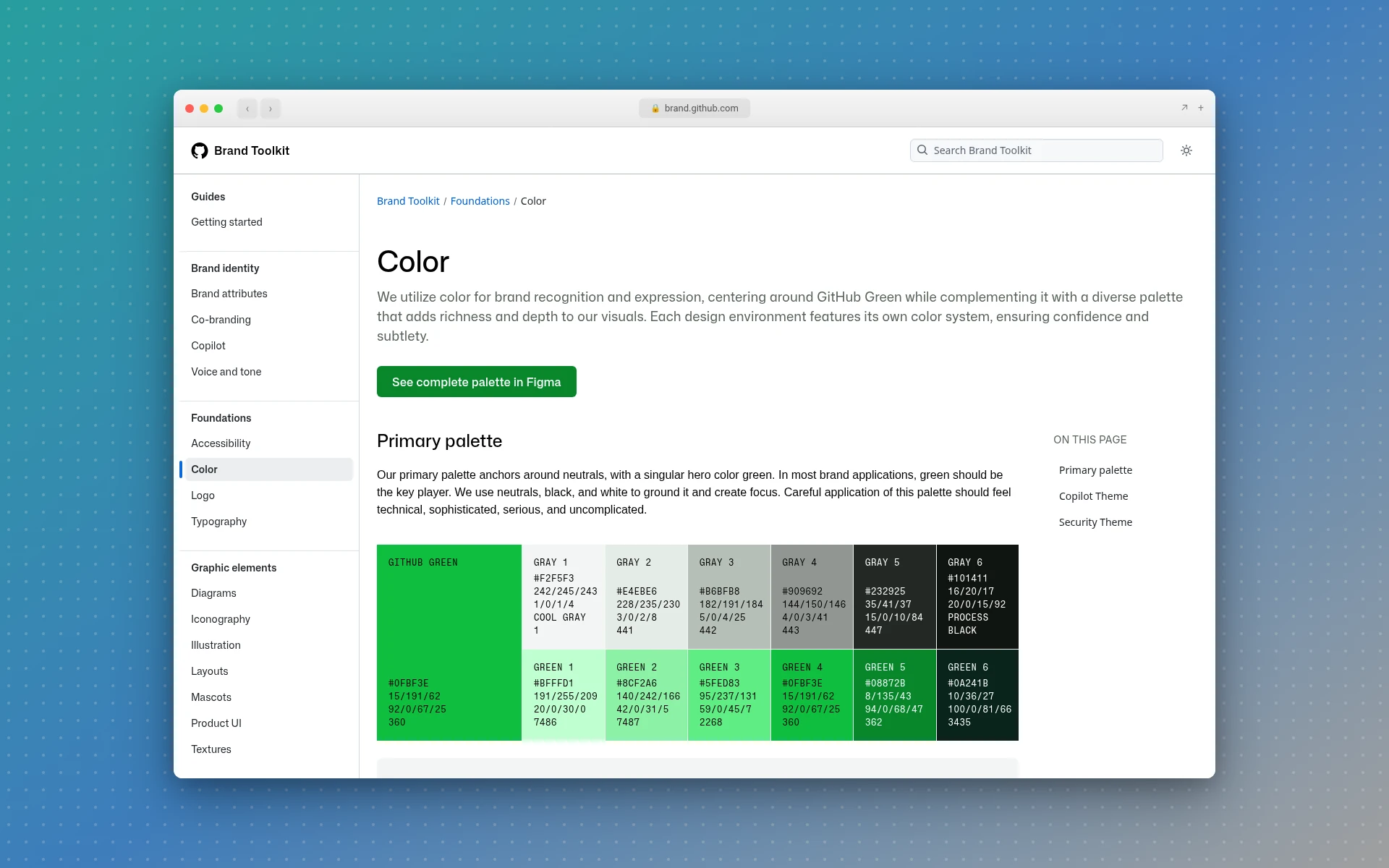
| GitHub | 1: a "singular hero color green" | Grays, green steps, theme accents | Not stated |
| Linear | 1: a desaturated blue | Light and dark accents | Not stated |
Four patterns show up:
- Long lists still have a short core. Dropbox names 16 accents and a whole grey scale, but only three core colors. Urban Sports Club has 15 in total and one primary.
- Four of the 10 lead with one color. Mailchimp calls Cavendish Yellow its "hero color." GitHub, Linear and Urban Sports Club each name a single lead as well.
- Black and white often count. Ubuntu and 1% for the Planet both put them in the core. That makes "three colors" easier to reach than it sounds.
- Acumen is the exception. Its 19 primary shades are far more than any other guide here, and it's the only one with a core above four.
The extras also come with fences around them. Urban Sports Club says plainly that "secondary colors are not to be used freely." Perforce wants colors "weighted towards the primary color palette," and Acumen says secondary colors "cannot be used on their own." Spotify's rule is just as blunt: "Don't introduce new colors outside our brand palette."
A new business can leave those long lists alone. Add an extra color when a real job turns up that your palette can't do, like a chart that needs a fourth series.
What Does Each Color in a Brand Palette Do?
A brand palette has three jobs to fill: a main color people remember you by, an accent that draws the eye to something specific, and neutrals that keep text and backgrounds readable. If a color doesn't have one of these jobs, you probably don't need it.
The main color goes on your logo and your packaging. Pick one if you can. You can have two, but a single color is far easier to keep consistent, and it's the choice four of the 10 guides make.
The accent handles buttons and highlights. Mailchimp's page gives a clean example: yellow is the hero, and "we use Peppercorn for accents."
The neutrals carry your body text and your invoices. Black, white and maybe a grey will do. GitHub says its primary palette "anchors around neutrals," with green as the one hero.
Here's how I'd scale that to the size of your business. This is my own rule of thumb, drawn from the counts above, not a standard:
| Your situation | Main | Accent | Neutrals | Total |
|---|---|---|---|---|
| Solo or local business | 1 | 1 | Black and white | 3 to 4 |
| Growing business with a site, print and ads | 1 to 2 | 1 to 2 | 2 to 3 | 4 to 7 |
| Product with its own interface, or several sub-brands | 1 to 3 | As many as you can govern | A full scale | 10 or more |
Most people reading this are in the first row. You can always add a color later, and it's much harder to take one back once it's on your signs.
How Many Colors Should a Logo Have?
A logo should usually have one or two colors, and three at the most. Fewer colors cost less to print and stay readable at small sizes. Your brand palette can be larger than your logo, so a three-color palette doesn't mean a three-color logo.
Todaymade's guide also caps logos at two to three shades. Part of the reason is cost, since screen printing "requires creating screens for each color," which adds up on small orders.
The other reason is that the colors won't always be there. Spotify says its green logo "should only be used on a black or white background," and switches to a monochrome logo everywhere else. That's why drawing a logo usually starts in solid black, and why simple minimalist logos tend to travel so well. You'll also want a version with no background at all, which this transparent logo guide explains.
There are famous exceptions. Google's logo has four colors, and when it redesigned its icon in 2015, it moved to a four-color "G" to match. You can see it next to single-color marks in these logo examples from famous brands.
But Google's colors are its whole idea. If yours aren't, stick with fewer.
What Is the 60-30-10 Color Rule?
The 60-30-10 rule is a guideline for how much of a design each color should cover: about 60% for a dominant color, 30% for a secondary color and 10% for an accent. It answers a different question from how many colors you need, because it's about proportion, not count.
It's a handy starting point, and it stretches. Wix's guide suggests a 60-20-10-10 split for a four-color scheme, as long as one color stays clearly dominant.
Real brands can look quite different, though. GitHub's color page shows one of its themes at roughly 80% black or white, 10% neutral, 5% green and 5% purple. So its famous green covers about 5% of the design. That's a useful reminder that your 60% can be white space, and your brand color can be the small thing people notice.
How to Build a Small Brand Palette
You don't need a color theory course for this. Seven steps will do it:
- Pick one main color. Start with what your business already has, like a shopfront or packaging. Then look at your closest competitors and avoid wearing the same color as all of them.
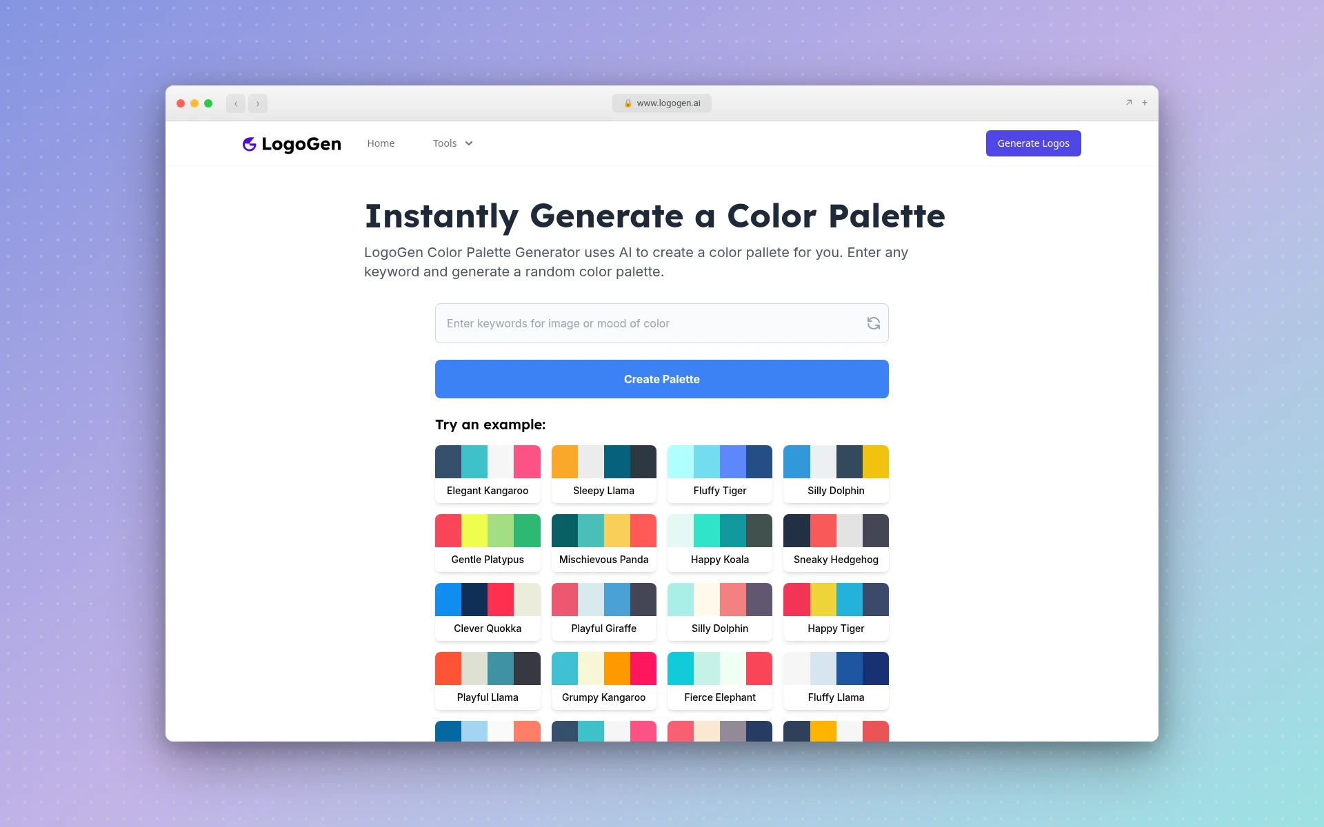
- Get some options on screen. The free color palette generator builds a palette from any keyword, so try "bakery" or "forest" and see what comes back. The random color generator is free too, and good for shaking loose an idea.
- Add one accent. Choose something that stands out next to your main color. Use it for the things you want clicked or read first.
- Add your neutrals. Black or a very dark shade for text, white or an off-white for backgrounds, and one grey if you need it.
- Check the contrast. The WCAG standard asks for a contrast ratio of at least 4.5:1 for normal text and 3:1 for large text. Logos are exempt, but your website's body copy isn't. The Nielsen Norman Group also suggests testing for color blindness, since some people can't tell certain colors apart.
- Try it in one color. Print your logo in black. If it stops making sense, the color was hiding a weak shape.
- Write the codes down. Keep the hex and RGB values for screens, and CMYK or Pantone for print. Ubuntu's guide gives its orange as hex, CMYK and Pantone, and a one-page note will do the same job for you. Your printer and anyone you hire later will ask for them.
If you're budgeting for a designer as well, here's what a logo costs. If you're still deciding on the overall look, these logo ideas for small business show how brands that started small approached theirs.
Frequently Asked Questions
Are two colors enough for a brand?
Yes. One main color and one accent, plus black and white for text and backgrounds, covers almost everything a small business makes. Mailchimp's brand page names just two colors in its text: Cavendish Yellow as the hero and Peppercorn for accents. You can add a third later if you run out of ways to separate things.
Do black and white count as brand colors?
They can. Ubuntu lists white and black in its core next to its orange, and 1% for the Planet does the same with its two blues. Other guides treat them as neutrals. Either way, plan for them, because they'll carry most of your text.
Can a brand have too many colors?
Yes, if nothing says which ones lead. Too many colors at once makes it hard to keep a clear visual order, and people stop connecting any one of them with you. Big palettes work when they have rules. Acumen lists 34 colors, but says its secondary shades can't be used without its primary ones.
Do tints and shades count as separate brand colors?
Usually not. A tint is a lighter version of a color you already have. Ubuntu gives its orange and aubergines tints from 10% to 90%, and tells you to "use only the percentages shown," but it doesn't list them as new colors. Pick a few tints if you need them for backgrounds or charts, and document them.
How many colors should a website use?
Start with three: a main color, an accent and a neutral for text and backgrounds. The Nielsen Norman Group recommends the same limit for digital design. Fewer colors make the page easier to scan, and your accent means something when it only appears on the things that matter, like a button.
Where to Go From Here
Three to five colors is plenty, and three is a great place to start. Give each one a job, then try a keyword in the free color palette generator to see your first set.
Once you've got your colors, you'll need something to put them on. If you'd like to see a few directions quickly, LogoGen is one option: you describe your company with its name and a short description, pick a style and colors, and it generates logos, typically in under 10 seconds. You could also browse the logo types first, or read up on what a logo mark is if you're still sorting out the vocabulary.