Your band has a name, a few songs and maybe a gig on the calendar. Now someone wants a flyer, the merch table needs a shirt, and the bass drum head is blank. Learning how to make a band logo isn't really about art skills. It's about making a mark that reads on a dark T-shirt, looks like your genre and still works when it's the size of a thumbnail on a phone.
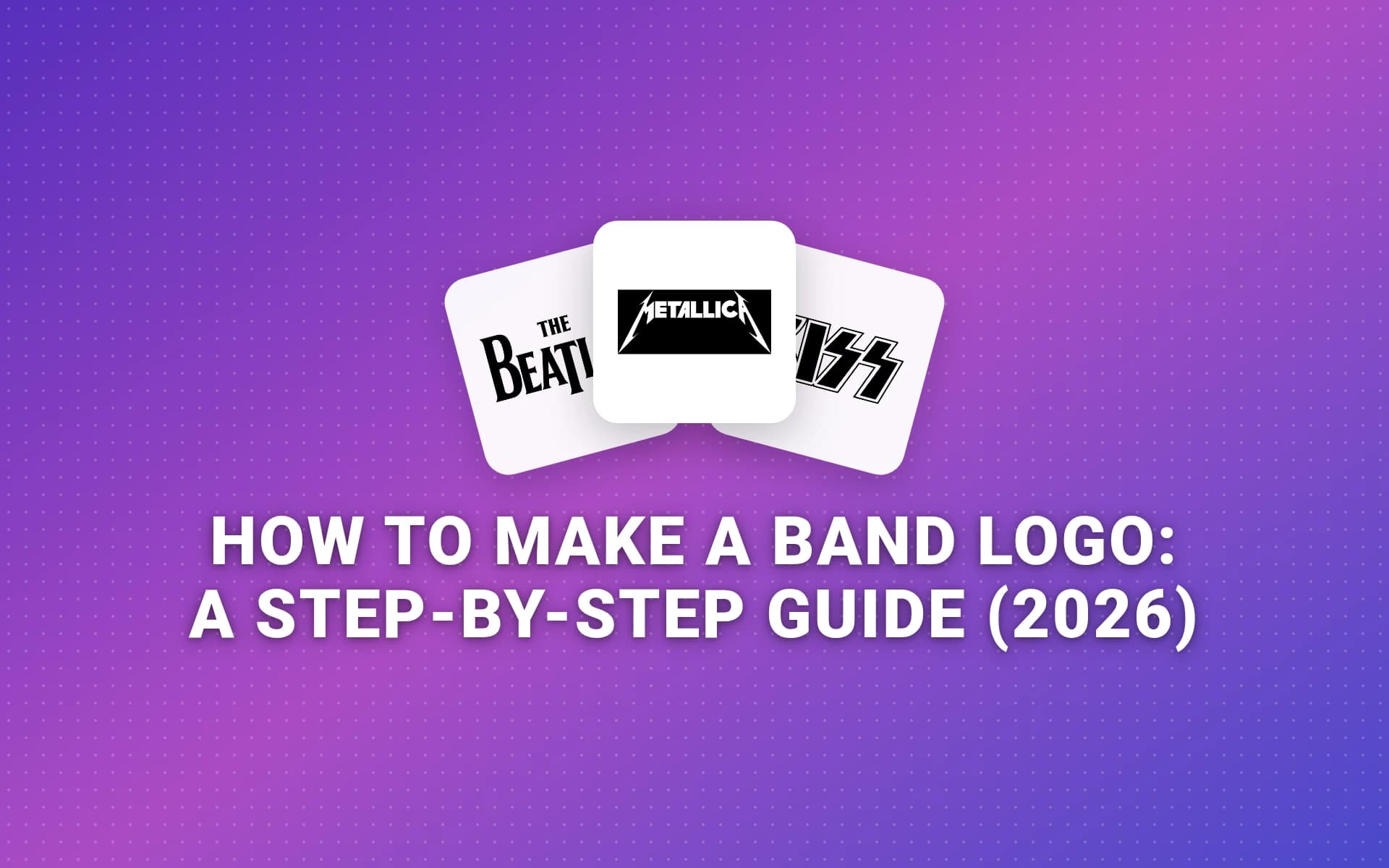
The bands that got it right are a good place to start. We lined up the official logos of six famous acts on November 1, 2026: Metallica, The Beatles, KISS, Iron Maiden, The Rolling Stones and the Ramones. Four of the six are nothing but the band's name in distinctive lettering. Only one, the Stones' tongue, skips the name entirely.
That's a useful hint for a new band. Your name is the thing people need to learn first, so the lettering does most of the work.
How Do You Make a Band Logo?
To make a band logo, settle the name, describe your sound in three words, study your genre's lettering habits, then sketch 20 or so rough ideas. Build the best one from a typeface you customize, keep it to one or two colors, turn it into a vector file, and test it on a shirt, a drum head and a phone screen.
The steps below take each stage in order.
What You’ll End Up With
By Step 9 you'll have a black version, a white version for dark shirts, a stacked version for a drum head and a small square mark, all as vector files a print shop will accept.
What You Need Before You Start
Paper, a pencil and a black marker cover the sketching part. For the finished file you need a vector app, because a band logo has to scale from a guitar-pick sticker to a stage banner. Inkscape is free and open source, and the guide to how to draw a logo compares it with four other drawing apps.
You also need your bandmates in the room for Steps 1 and 2. A logo one member loves and the rest tolerate tends to get quietly redesigned a year later.
Step 1: Lock the Band Name First
Don't design around a name you might change. Lettering is built letter by letter, so a new name means starting over.
If the name is still up for debate, generate a long list with the band name generator, then search your favorites on streaming services and social platforms. If another act already fills the results, fans won't find you.
Check the legal side too. The USPTO defines a trademark as "any word, phrase, symbol, design, or a combination of these things that identifies your goods or services" (USPTO). Band names and logos fall under that, so look up existing acts before you print anything.
Step 2: Describe Your Sound in Three Words
Get everyone to agree on three words that describe how the band sounds and feels live. Raw, loud, sweaty. Dreamy, slow, warm. Tight, funky, bright.
Write them on top of your sketch page. When you're choosing between two ideas in Step 5, the one that fits the three words wins, even if the other one is cleverer.
This also stops the logo from fighting the music. A delicate script on a hardcore band's shirt sends the wrong message before anyone hears a note.
Step 3: Learn Your Genre’s Lettering Habits
Fans read a band logo the way they read a record cover: as a quick guess about the sound. Each scene has its habits:
- Metal: spiky, hand-drawn letters, symmetry, and sometimes legibility sacrificed for texture. Black metal pushes that furthest.
- Punk and hardcore: stencils, ransom-note cutouts, thick block letters, anything that looks photocopied.
- Indie and electronic: clean sans-serif type, lots of spacing, often all lowercase.
- Folk and country: hand lettering, scripts, and woodcut or letterpress textures.
- Hip-hop: graffiti forms, heavy outlines and custom ligatures.
- Classic rock and soul: bold display type that nods to old posters. The retro logos guide covers that look.
Use the habit, then break one rule on purpose. A punk band with a neat, almost corporate wordmark stands out on a bill full of ransom notes.
Step 4: Pick a Logo Type
A band logo is usually one of three types: a wordmark (the name in distinctive lettering), a symbol (a picture with no words), or an emblem (the name inside a badge or seal). New bands should start with a wordmark, because the name is what fans need to remember.
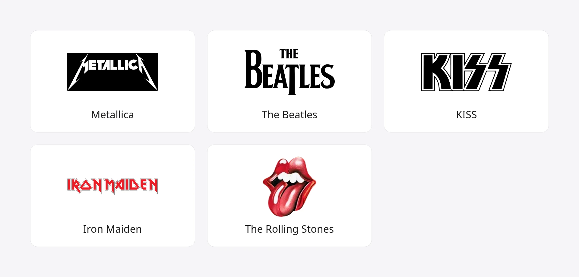
Here's what we found when we lined up the six logos on November 1, 2026, with the source behind each story linked:
| Band | Logo type | Where it came from, or what to notice |
|---|---|---|
| Metallica | Wordmark | Drawn by singer James Hetfield, and revived by the agency Turner Duckworth for the Death Magnetic album (Turner Duckworth) |
| The Beatles | Wordmark | Sketched "onto a scrap of paper" by drum shop owner Ivor Arbiter in April 1963. The big B and dropped T were there "to emphasise the word 'beat'" (The Beatles Bible) |
| KISS | Wordmark | Ace Frehley drew the first sketch and Paul Stanley refined it (Ultimate Classic Rock) |
| Iron Maiden | Wordmark | Angular letters with pointed ends, longer at the first and last letters, so the name looks balanced on a banner |
| The Rolling Stones | Symbol | Designed by John Pasche, then a Royal College of Art student, for £50 in 1970 (V&A) |
| Ramones | Emblem | Arturo Vega based it on the US presidential seal after a trip to Washington (NME) |
A few things stand out:
- Four of the six are pure wordmarks. They don't need a symbol, because the lettering is the identity.
- None of the five with a known origin was first drawn by an agency. A singer, a guitarist, a drum shop owner, an art student and the band's own art director started them. Turner Duckworth only revived Metallica's, decades later.
- The symbol came from a band that was already famous. The Stones could drop the name because everyone knew it. A new band can't.
If you want to read more on the difference between these types, the guide to what a logo mark is covers symbols, wordmarks and combination marks. The wordmark logos guide is the one to read if, like most bands, you're going type-only.
Step 5: Sketch 20 Rough Ideas
Grab the sketch page with your three words on top and fill it. Aim for 20 ideas, each no bigger than a postage stamp, and spend under a minute on each.
Small sketches force simple shapes. You can't add fine spikes or tiny details at that size, which is good, because the logo will often be that small on a phone.
Try a range:
- The full name in a few lettering styles
- An initial or two, stacked or interlocked
- The name inside a shape: a circle, a shield, a banner
- A small mark built from a letter, an instrument or an in-joke
The Beatles' logo started this way: a quick sketch in a drum shop, which a local sign writer then painted onto Ringo Starr's bass drum head (The Beatles Bible).
Step 6: Start From a Typeface, Then Make It Yours
None of the four wordmarks in the table looks like a stock font left untouched. The letters are stretched, cut, pointed or dropped out of line, and that hand work is what makes the name feel owned.
Pick a typeface that fits your three words, type the band name in it, then print it out and draw over it. Common moves:
- Tighten or widen the spacing between letters by eye.
- Exaggerate one letter. The Beatles' dropped T is the textbook case.
- Match the first and last letters so the name feels framed, the way Metallica's M and A extend into points.
- Cut or connect strokes so the letters lock together.
Check the font license before you print shirts. Google says its fonts are open source and can be used commercially, including in logos, but fonts from other sites often come with personal-use-only terms.
Step 7: Keep It to One or Two Colors
Merch is where most band logos earn their keep, and color count drives the price. One print shop's cost breakdown puts it plainly: "Each color in your design requires a separate screen," and "Going from four colors to two cuts your screen fees in half" (Printable Press).
The Ramones show why that matters. Arturo Vega's shirts, silk-screened with the band's logo, became the band's "most consistent source of income," as The Lo-Down reported from Spin (The Lo-Down).
So design in solid black first. If it works in black on white and white on black, add one accent color at most. If you need a starting palette, the color palette generator builds one from a single keyword.
Step 8: Turn It Into a Vector File
Photograph your final sketch straight on, in even light, and bring it into your vector app. Then either auto-trace it or redraw it over the photo with the pen tool. Redrawing takes longer but gives you cleaner curves and sharper spikes.
The Illustrator logo tutorial walks through building and tracing shapes step by step. When you're done, export:
- An SVG or PDF for print shops and the drum head
- A large PNG with a transparent background for flyers, videos and the web. The transparent logo guide shows how.
- A white version for dark shirts and stage screens
- A square crop (an initial or a small mark) for places where the full name won't fit
Step 9: Test It on a Shirt, a Drum and a Phone
A band logo lives in harder places than most business logos. Test it in each one before you call it finished:
- Across the room. Print it at shirt size, pin it up and walk to the back of the room. Can someone who's never heard of you read the name?
- On black. Most band shirts are dark. Check the white version.
- On a round drum head. A long, thin wordmark leaves big empty gaps on a circle. You may need a stacked version.
- Tiny. Shrink it to sticker and social-avatar size. Spikes and thin strokes are the first things to blur.
- On streaming profiles. Spotify's artist image guidelines say "Don't include text, advertising, or busy backgrounds," and avatars must be "at least 750px x 750px" (Spotify for Artists). Plan on a band photo for Spotify, and save the logo for cover art, merch and your other channels.
Also check what your letters look like to someone else. KISS's lightning-bolt S's resembled Nazi SS imagery, and Paul Stanley has said the logo was banned in Germany. As Ultimate Classic Rock puts it, "To this day, Kiss merchandise looks different in Germany" (Ultimate Classic Rock).
What Font Do Band Logos Use?
Most band logos use a customized typeface or hand-drawn lettering rather than a font straight out of the box. Metal bands lean on blackletter and angular display faces, punk on stencils and heavy block type, and indie bands on clean sans-serifs. The font is a starting point. The edits are what make it the band's.
If you're picking one, choose a typeface that's licensed for commercial use, because the logo will end up on things you sell.
How Much Does a Band Logo Cost?
A band logo costs nothing but time if you make it yourself with free software like Inkscape. Hiring a designer costs more, and the range depends on who you hire and how much custom lettering you need. The breakdown of how much a logo costs compares the main routes.
Whichever way you go, budget for the printing too. Every extra color on a screen-printed shirt adds a screen.
Common Mistakes
- Unreadable for its own sake. Texture is fine for a black metal band whose fans expect it. For everyone else, if strangers can't read it, it isn't doing its job.
- Too many colors. A five-color logo is a five-screen shirt.
- Designing only the wide version. Bands need a stacked version and a square mark too.
- Copying a famous logo too closely. Borrowing Metallica's pointed M or the Stones' tongue invites a trademark letter.
- Using a free font with a personal-use license. It's fine for a demo flyer. It's a problem on merch.
- Skipping the band vote. Get agreement in Step 2, not after the shirts arrive.
Pro Tips
- Make it symmetrical if you can. Symmetrical wordmarks like Iron Maiden's look strong on a banner, a drum head and the middle of a shirt.
- Keep a texture version and a clean version. Use the gritty one on posters and the clean one where it has to be small.
- Steal from your own artwork. A shape from your first record cover or your hometown can become the small mark.
- Look at marks with a twist. These cool logos show how much one clever detail can carry.
- Keep your sketches. Rejected ideas make good tour-shirt variations later.
Frequently Asked Questions
How do I create a band logo on my own?
Start with the band name and three words for your sound. Sketch 20 small ideas, pick the one that fits those words, then rebuild it from a commercially licensed typeface you customize by hand. Trace it in a vector app like Inkscape, keep it to one or two colors, and test it on a dark shirt and at avatar size.
Should a band logo be readable?
For most bands, yes. A new band needs people to learn its name, and the logo is often where they first see it. Extreme metal is the exception: its fans expect dense, hard-to-read lettering, and a readable logo can look out of place on that bill. Even then, keep a plain version for streaming, ticketing and press.
Can I make a band logo for free?
Yes. Paper, a pencil and a free vector app like Inkscape are enough. Use a typeface whose license allows commercial use, such as one from Google Fonts, because the logo will end up on merch. Your only real cost comes later, when you print shirts and stickers.
Does a band logo need a symbol?
No. Four of the six famous band logos in the table above are wordmarks with no symbol at all. A symbol helps once fans already know your name, for small spaces like stickers and avatars. Until then, the lettering does the job.
Do I need to trademark my band logo?
You don't need to register it to use it, but you should check that no one else is using a similar name or mark before you print anything. Registering adds protection if your band starts selling merch or touring widely. Rules differ by country, so check the USPTO or your national trademark office, or ask a trademark attorney.
Where to Go From Here
Tonight's job is small: get the band to agree on the name and the three words, then fill one page with sketches. A famous logo can start as a scrap of paper in a drum shop.
If you'd like a few directions to react to before you start sketching, LogoGen is one option: you type the band's name and a short description, pick a style and colors, and it generates logo options, typically in under 10 seconds. It supports English characters only, so a name with an umlaut needs hand finishing. Treat what comes back like a page of thumbnails and refine your favorite through Steps 5 to 9. Or browse all the logo types to see which style fits your sound.