Search for cool logos and you'll get a wall of pretty marks with no explanation. That's fine for a mood board. It's not much help when you want to know why a logo feels clever, or whether the story everyone repeats about it is even true.
So I picked 11 logos that do something unusual, like hiding a number, packing four meanings into one line, or never looking the same twice. On October 22, 2026, I traced each story back to the earliest source I could open and noted who tells it. Only 5 of the 11 are confirmed in the brand's or designers' own words. The other 6 I could confirm only through press reports, and in one case the brand's own explanation isn't the one most people repeat.
What Makes a Logo Cool?
A cool logo is a simple mark that rewards a second look. It usually hides a detail in negative space, packs two meanings into one shape, or turns a rule of design on its head. The best ones still read instantly at small sizes, so the trick is a bonus, not a puzzle you need to solve.
That last part matters. Every logo below works even if you never notice the clever bit. The hidden bear, the 31 and the handshake are rewards for people who look closer.
11 Cool Logos at a Glance
Each row links to the source I used. "Who tells the story" says whether the brand or its designers confirm the idea in their own words (on their site or quoted directly), or whether I found it only in press coverage.
| Logo | The trick | Who tells the story |
|---|---|---|
| Formula 1 | A "1" in the negative space | Brand (F1's head of marketing), with a different explanation |
| Baskin-Robbins | A hidden 31 | Press only |
| Toblerone | A bear inside the mountain | Brand confirms the bear (Mondelez statement) |
| Tostitos | Two people sharing a chip and salsa | Press only |
| Hyundai | An H that's also a handshake | Press only (Jalopnik, citing Hyundai) |
| Airbnb | One line with four meanings | Designer (DesignStudio) |
| Unilever | A U built from 25 icons | Press only |
| Wikipedia | An unfinished puzzle globe | The project's own pages |
| NBC | Eleven feathers cut to six | Designer (Chermayeff & Geismar & Haviv) |
| Mozilla | A web address as a wordmark | Press only |
| MIT Media Lab | 40,000 versions from one system | Press only |
A note on method: I left out popular "hidden meaning" stories I couldn't trace to a named source.
Two famous ones are missing for a different reason. FedEx's arrow and Amazon's smile are well sourced, and they're already covered in the roundup of logo examples from famous brands, so this list gives the space to others.
Cool Logos With Hidden Pictures and Numbers
These four hide a second image inside the first. It's what most people picture when they call a logo cool, and it's easy to overdo until the mark looks busy.
1. Formula 1
F1 unveiled its current logo on November 26, 2017, right after the Abu Dhabi Grand Prix. Wieden+Kennedy designed it, and it replaced the "flying one" mark the sport had used since 1993, per ESPN.
Most hidden-logo roundups point to the gap next to the F. As Speckyboy puts it, "the space after the 'F' reveals the '1'." F1's head of marketing at the time, Ellie Norman, described it differently: "It takes its inspiration from the low-profile shape of the car, two cars crossing a finish line and it is incredibly bold and simple" (ESPN).
Why it's cool: two readings, both about racing. Whether you see a numeral or two cars at the line, the mark never stops saying F1.
2. Baskin-Robbins
When Baskin-Robbins refreshed its brand in April 2022, its first refresh in 20 years, QSR Web described the logo this way: "The pink and brown logo has a BR and number 31 (for 31 flavors, of course) hidden inside."
The pink parts of the B and R form the 31, so the hidden detail is the 31-flavors promise itself. You read "BR" first, and the number shows up a beat later.
3. Toblerone
Look closely at the mountain on a Toblerone box. According to Euronews, "Hidden in the mountain peak there's also a heraldic bear, the symbol of Bern."
In 2023 the Matterhorn itself had to go. Swiss rules reserve national symbols for milk-based products made entirely in Switzerland, and Toblerone was moving some production to Slovakia. Mondelez, which owns the brand, said the new packaging would carry "a modernized and streamlined mountain logo," and added: "The famous hidden bear is retained" (ABC News).
4. Tostitos
This one is easy to miss. In the middle of the word, Mashed explains, "the two lower case 't's' are actually people, and between them is the letter 'i' upon which rests a bowl of salsa." A chip links the two figures over the bowl.
I couldn't find the brand telling this story itself, so treat it as the popular reading. It's still the clearest example I know of a scene hidden in plain type: two friends sharing a snack, tucked inside eight letters.
Cool Logos Where One Shape Means Two Things
A double-meaning symbol is different from a hidden picture. Nothing is tucked away. The same shape simply reads two ways at once.
5. Hyundai
Hyundai's H looks like a plain initial. According to Jalopnik, Hyundai says it's two people shaking hands: "one of the fine folk in its logo is a company representative, the other a satisfied customer." The oval around them stands for the company's worldwide reach.
You don't need the story for the logo to work. The H reads as an H either way.
6. Airbnb
Airbnb's symbol, the Bélo, came out of its 2014 rebrand with the London agency DesignStudio. Dezeen reported that the single looping line represents a person with their arms raised, a location marker and an upside-down heart (people, places and love), while also forming the letter A.
DesignStudio's James Greenfield explained the goal: "The idea we finally settled on was creating a brand that anyone can draw, something that went beyond language and becomes a universal mark" (Dezeen).
Why it's cool: four ideas, one stroke, and you can draw it with your finger on a fogged window. If you like marks like this, the abstract logos guide shows how simple shapes carry meaning without spelling it out.
Cool Logos Built From Many Pieces
These two look like one shape from a distance and break into many parts up close.
7. Unilever
Unilever's big blue U arrived in 2004. The Grocer described it as "a composite of 25 miniature icons" that "represent the different aspects of the company's business," and reported that the company spent around £6.7m developing and marketing it.
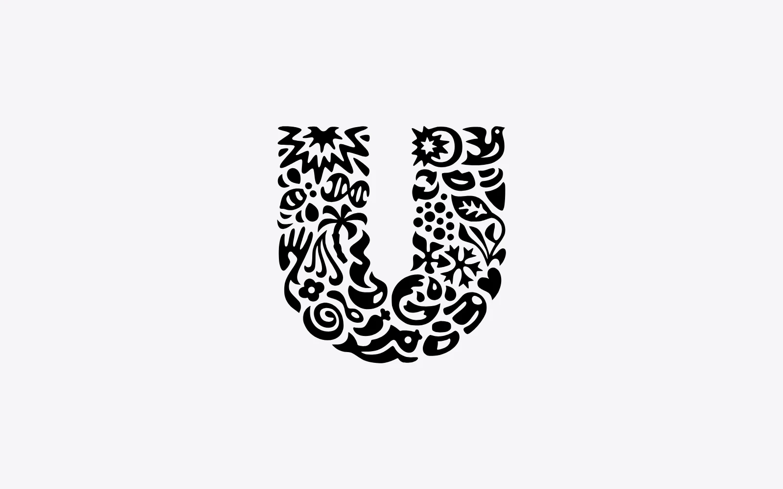
At a glance it's a letter. Lean in and it turns into a collection of small drawings. The catch is size: 25 tiny icons need room, so a logo built this way struggles at favicon scale.
8. Wikipedia
Wikipedia's puzzle globe comes from a 2003 contest won by Paul Stansifer. Wikipedia's own article on its logo says, "The unfinished puzzle symbolizes the project's state as a perpetual work in progress." Each piece carries a character from a different writing system, and the Wikimedia Foundation rebuilt the globe as a 3D model in 2010 to fix errors in some of those characters.
The gap at the top has a sense of humor too. Wikimedia's logo notes suggest the missing pieces "may consist of characters for fantasy and archaic languages which will unlikely ever have active projects, like Klingon lettering and Hieroglyphics."
Cool Logos That Got Cooler by Losing Detail
Sometimes the clever move is taking things away.
9. NBC
A peacock first showed up on NBC's screens in 1956, as a promotional image for color television. When Chermayeff & Geismar & Haviv redrew it, "the number of feathers reduced from eleven to six," the bird's outline was simplified and the feathers were given matching shapes, to "make the peacock both a more functional and ownable symbol" (Chermayeff & Geismar & Haviv).
There's no hidden picture here, just five fewer feathers. The minimalist logos guide covers the same idea from the ground up.
Cool Logos That Play With Type
A wordmark can be clever too, if the letters do something unexpected.
10. Mozilla
In January 2017, Mozilla finished a rebrand that the London studio Johnson Banks had run in public since June 2016, sharing ideas and taking feedback on a blog. The result, per Dezeen, sets the name in a Courier-like font with the "i" and "l"s swapped for a colon and two forward slashes, the way they appear after "http" in a web address: moz://a.
The joke only works for this one company. A browser maker spelling its name like a URL is clever because nobody else could use it. The wordmark logos guide has more on making letters carry an idea.
Cool Logos That Change Every Time
The last trick breaks a basic rule of logo design: that a logo should always look the same.
11. MIT Media Lab
In 2011, the MIT Media Lab got a logo designed by Richard The with "40,000 possible variations," generated from "three shapes and 12 different colors" (The Next Web). According to Gizmodo, the algorithm gave every team and employee a logo of their own.
It didn't last. In 2014 the lab unveiled a new identity led by Pentagram's Michael Bierut, built on "the same 7-by-7 grid as the old logo," Gizmodo reported.
Why it's cool: it treats the logo as a system that draws itself. Its replacement after three years is worth noticing too. In my view, a logo that changes constantly asks a lot of people's memory.
What These Cool Logos Have in Common
Lined up side by side, the 11 logos show a few patterns worth stealing.
- The trick never replaces the basics. Nearly all of them still read as a simple mark at a glance. You can recognize Airbnb's loop or NBC's peacock without knowing a word of their backstory.
- Hidden pictures are the most common trick here. Four of the 11 (Formula 1, Baskin-Robbins, Toblerone and Tostitos) hide a second image or number inside the first.
- Many famous stories are press stories. Only 5 of the 11 are confirmed in the brand's or designers' own words. For Baskin-Robbins, Tostitos, Hyundai, Unilever, Mozilla and the MIT Media Lab, I found the idea described only in press coverage.
- The official story can differ from the popular one. F1's marketing head talked about two cars crossing a finish line. The roundups talk about a hidden 1.
- Clever survives change. Toblerone kept its bear through a forced redesign, and NBC's peacock got stronger with fewer feathers.
Do Hidden-Meaning Logos Work for a Small Business?
They can, as long as the logo works without the secret. A hidden detail is a bonus that people discover over time, so a new business shouldn't depend on customers spotting it. Start with a clear, simple mark, then add a clever detail only if it doesn't make the logo harder to read.
A good test: show your logo to someone for two seconds and ask what they saw. If they can't describe it, the trick is getting in the way. The logo mark explainer has more on when a symbol is ready to stand on its own.
How Do You Make a Cool Logo?
To make a cool logo, start with one idea tied to your business, sketch it as simply as you can, then look for a second reading in the shapes or the empty space around them. Test it small and in one color before you commit. Here's the process, step by step.
- Settle the name first. Clever letterforms depend on the exact letters. The business name generator helps if you're still deciding.
- Write down one thing you want people to feel. Speed for F1, a lot of choice for Baskin-Robbins, belonging for Airbnb.
- Look for a shape that's already in your name or product. Tostitos found people in two t's. Hyundai found a handshake in its H.
- Try negative space. Sketch the mark in black, then study the white areas between the shapes.
- Cut detail until it breaks, then add one piece back. NBC went from eleven feathers to six.
- Choose two or three colors. The color palette generator gives you a starting set from one keyword.
- Test it at small sizes and on dark backgrounds. The transparent logo guide shows how to export a version with no background box.
- Generate a few directions before you choose. It's easier to spot a clever detail when you compare options side by side. LogoGen is one option for that: you describe your business with its name and a short description, pick a style and colors, and it generates logo options, typically in under 10 seconds.
If you want to see more styles first, browse the logo types or the sportswear logo roundup, which shows how athletic brands keep their marks bold.
Frequently Asked Questions
What is the coolest logo ever?
There's no official ranking, so it comes down to taste. If you like hidden details, FedEx's arrow and Toblerone's bear are hard to top, and Toblerone earns extra points for keeping its bear through a forced redesign in 2023. If you prefer clever systems over hidden pictures, the MIT Media Lab's 40,000-version logo from 2011 is the boldest pick.
What logos have hidden meanings?
Formula 1 (a 1 in the gap beside the F), Baskin-Robbins (31 inside the B and R), Toblerone (a bear in the mountain) and Tostitos (two people sharing a chip over a salsa bowl) are well-known examples. FedEx and Amazon are two more, covered in the famous logo examples roundup.
Is a hidden meaning required for a cool logo?
No. NBC's peacock and Mozilla's moz://a have no hidden picture. One is cool because it was simplified, the other because of a typographic joke that only fits that company. A hidden detail is just one way to make a logo memorable. A strong idea that reads clearly is what matters.
Can I copy a cool logo trick for my brand?
You can borrow the technique, like negative space or a double-meaning letter, but not the design. Famous logos are trademarks, and a mark that looks similar can cause legal trouble. Apply the trick to your own name and product, then search the USPTO trademark database before you use it.
What style of logo is coolest right now?
Simple marks that still work as tiny app icons. When Google redrew its logo in 2015, it said the goal was to work "even on the tiniest screens" (Google). The modern logos guide walks through the clean geometry most current marks share.