Most lists of logo ideas for small business show you polished marks from companies with a branding agency on retainer. That's not much help when you're one person with a shop, a van or a stall at the Saturday market, and a logo budget that's mostly your own evenings.
So I went looking for logos that started where you are. On October 27, 2026, I read the brand's own history page, or a named report, for seven companies that began tiny and kept a version of their early identity as they grew. Three of the seven started in a space under 200 square feet, and a fourth began as a hot dog cart in a park.
Each one shows a different logo idea you can borrow without copying anyone: draw what you sell, put a real face on it, hand-letter your name, and four more. You'll also find a quick table of which idea suits which kind of business, and a short process for picking yours.
What Are Good Logo Ideas for a Small Business?
Good logo ideas for a small business are simple ones you can explain in a sentence: a picture of what you sell, your own name in distinctive lettering, the founder's portrait, a mascot, a badge, or a bold type-only mark. The best fit is the idea your customers will connect to your business at a glance.
Here are the seven ideas this page covers, each with a brand that started small:
- Draw what you sell: Blue Bottle Coffee's blue bottle
- Put the founder's face on it: Burt's Bees and its woodcut beekeeper
- Turn a real person into a mascot: Wendy's red-haired girl
- Hand-letter your name: Ben & Jerry's chunky lettering
- Let the type do all the work: Shake Shack's big letters
- Wrap the name in a badge: Harley-Davidson's Bar & Shield
- Add one shape that hints at the service: In-N-Out's yellow arrow
7 Small Business Logos at a Glance
Every row links to the source I used for the starting story. The "first space" column is what struck me most: none of these began with a storefront you'd call impressive.
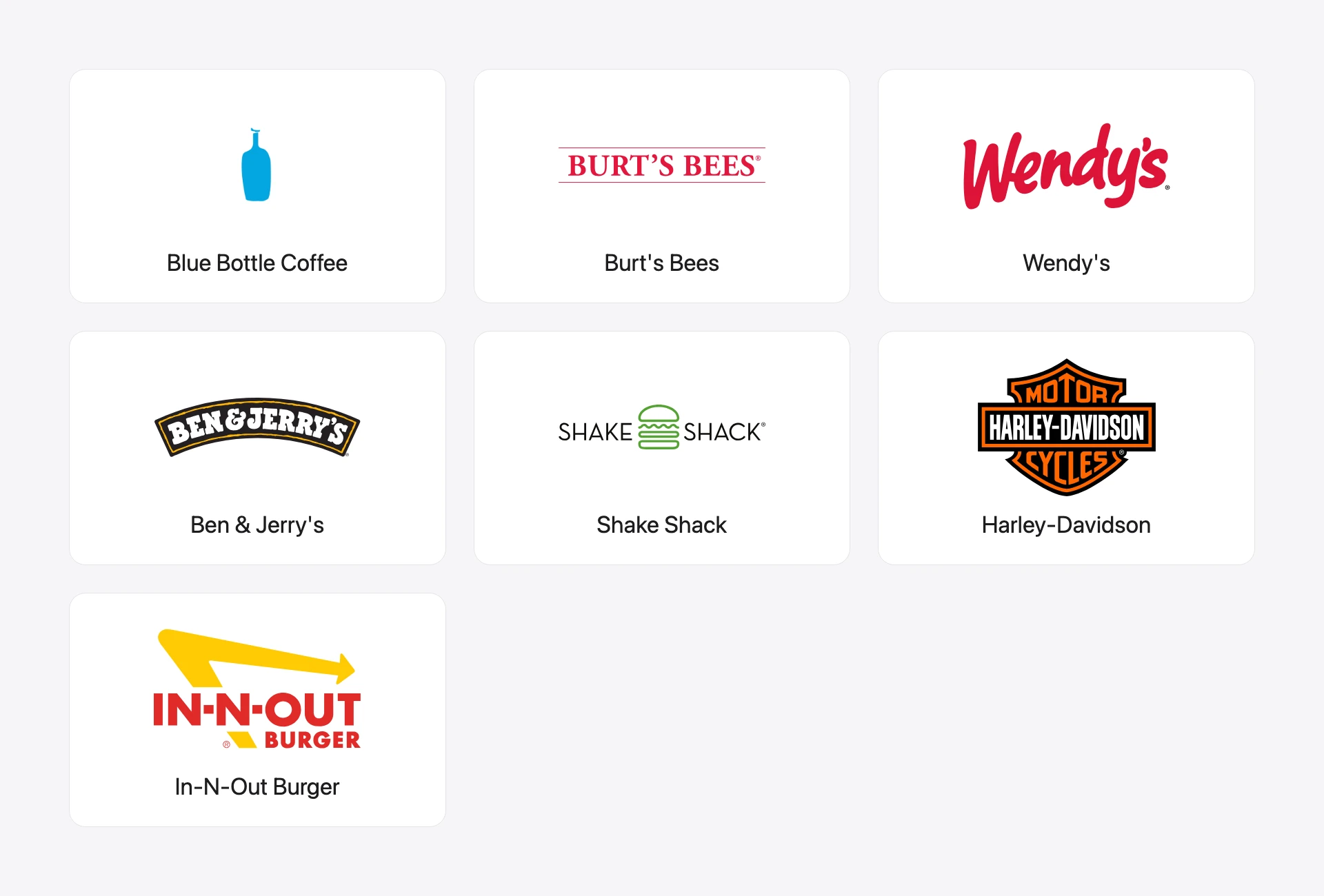
| Brand | Logo idea | How it started | First space |
|---|---|---|---|
| Blue Bottle Coffee | Draw what you sell | Roasting beans for farmers' markets, 2002 | A 186-square-foot potting shed in Oakland |
| Burt's Bees | The founder's face | Candles made from a beekeeper's beeswax in Maine, 1984 | Not stated in my sources |
| Wendy's | A real person as mascot | Dave Thomas opens the first restaurant, 1969 | One restaurant |
| Ben & Jerry's | Hand-lettered name | A scoop shop opens on May 5, 1978 | A renovated gas station in Burlington, Vermont |
| Shake Shack | Type-only | A trial run with a hot dog cart, 2003 | A cart in Madison Square Park |
| Harley-Davidson | A badge | Two friends build motorcycles, 1903 | A 10 x 15-foot wooden shed |
| In-N-Out Burger | One shape that hints at the service | A drive-thru stand, 1948 | A stand "no bigger than 100 square feet" |
A note on method: these are founding stories, not a ranking. I left out brands whose logo history I couldn't pin to a reliable source, which is why a few famous "started in a garage" names aren't here.
The 7 Logo Ideas, One by One
1. Draw What You Sell: Blue Bottle Coffee
The most direct logo idea there is: a picture of the thing. Blue Bottle's mark is a simple blue bottle outline, and it works because the name and the picture say the same thing twice.
The company started small. James Freeman founded it in 2002 while roasting beans in a 186-square-foot potting shed in Oakland's Temescal district, and he sold them at farmers' markets, according to Tasting Table. The name itself nods to an old Vienna coffee house called The Blue Bottle.
Borrow it if: your business name already contains an object (a bottle, a key, a leaf, a wrench). Draw that object as plainly as you can, in one color. If the drawing needs more than a few lines, simplify it until it doesn't. The minimalist logo guide shows how far you can strip a picture back and still have it read.
2. Put the Founder's Face on It: Burt's Bees
When the person behind the business is part of the appeal, put them in the logo. Burt's Bees uses a woodcut-style portrait of co-founder Burt Shavitz, the bearded Maine beekeeper whose beeswax went into the company's first candles.
That portrait wasn't made by an agency. The Boston Globe reported that Tony Kulik, a self-taught engraver in Belfast, Maine, cut it from a Polaroid that Shavitz's mother had taken. Kulik had met the founders at craft fairs in the late 1980s.
Borrow it if: customers buy from you because of you: a barber, a baker, a tattoo artist, a one-person repair service. Use a single-color line drawing rather than a photo, because a photo turns to mush at small sizes and won't print on a rubber stamp.
3. Turn a Real Person Into a Mascot: Wendy's
A mascot gives people a face to remember without making you the face. Wendy's took a real person and turned her into a cartoon: the girl in the logo is founder Dave Thomas's daughter, Melinda Lou, whose siblings called her "Wenda," which became "Wendy," per the Associated Press.
Thomas opened the first Wendy's in 1969. When the chain updated its logo in 2012, it was the first change since 1983, and it kept three things: the girl, the color red and the swoosh in the lettering that executives call "the wave."
Borrow it if: your name is a person's name, or you sell to families and kids. A friendly character also gives you something to put on stickers, menus and social posts that isn't just your wordmark.
4. Hand-Letter Your Name: Ben & Jerry's
Ben & Jerry's doesn't look corporate. Its logo is the name in chunky, hand-drawn-looking letters. That loose lettering matches a brand whose founders learned their trade from a $5 correspondence course on ice cream making, as History.com tells it.
The first scoop shop opened on May 5, 1978, in a renovated gas station in Burlington, Vermont. A hand-lettered name fits that story far better than a sleek sans-serif would.
Borrow it if: you run something warm and local: a café, an ice cream shop, a craft brand, a kids' business. You don't need to be a calligrapher. Write your name 30 times with a marker, pick the version you like, and trace it into a vector. The guide to drawing a logo walks through that sketch-to-vector step.
5. Let the Type Do All the Work: Shake Shack
Sometimes the cleanest idea is no picture at all. Shake Shack's identity is built on type: Pentagram's case study describes the original logo as "Coney Island-sized letters" across the kiosk roof, set in the typeface Neutraface.
And the business started about as small as a restaurant can. Pentagram says founder Danny Meyer staged the first Shake Shack trial run with a hot dog cart in Madison Square Park in 2003, and the permanent kiosk followed in 2004.
Borrow it if: your name is short, easy to say and already distinctive. A strong typeface, used big and consistently on your sign, cups and bags, can carry a whole brand. The wordmark logos page covers how to pick and adjust a typeface for this.
6. Wrap the Name in a Badge: Harley-Davidson
A badge or emblem puts your name inside a shape, which makes it feel official and gives it a natural home on patches, labels and signs. Harley-Davidson's Bar & Shield is the classic case.
The company began in 1903, when William Harley and Arthur Davidson built a 10 x 15-foot wooden shed to work in, according to Harley-Davidson's own archive. The logo came seven years later. The museum's Bar & Shield history says a trademark application went to the U.S. Patent Office on July 19, 1910, and admits that "no archival records have confirmed who designed the logo nor what inspired them."
Borrow it if: you sell physical goods or services with a craft or trade feel: a garage, a brewery, a landscaper, a clothing label. Keep the text inside the badge to your name (and maybe the founding year), or it'll be unreadable on a business card. The retro logos page has more on this vintage style.
7. Add One Shape That Hints at the Service: In-N-Out Burger
You don't need a full illustration to say something about how you work. In-N-Out's logo is mostly its name, plus a yellow arrow. To me that arrow reads as motion, which suits a name that promises you'll be in and out.
The original stand was tiny. Harry and Esther Snyder opened it in Baldwin Park, California, in 1948, and it was "no bigger than 100 square feet," according to Tasting Table. Harry developed a two-way speaker box so customers could order without leaving their cars.
Borrow it if: you want a type-led logo with one small extra: an arrow for a delivery or moving business, a drop for a plumber, a spark for an electrician. One shape is enough. Two starts to look busy.
What These Small Business Logos Have in Common
Reading the seven stories side by side, a few patterns stood out:
- They started tiny. Three began in spaces under 200 square feet (a 100-square-foot stand, a 150-square-foot shed and a 186-square-foot potting shed), one in a hot dog cart and one in an old gas station. A small start didn't stop any of them from having a clear idea.
- Each logo holds one idea. A bottle. A face. A badge. None tries to show the product, the founder and the town at once. The University of Rhode Island's Small Business Development Center puts it bluntly: "A logo isn't the place to cram in five ideas" (URI SBDC).
- The idea comes from the business itself. The bottle is in the name, the face is the founder's, the girl is the founder's daughter. Nobody picked a random swoosh off a template.
- They evolved, they didn't restart. Wendy's went 29 years between logo changes and still kept the girl and the red. A clear first idea is something you can refine for decades.
If you want more of the backstory behind famous marks, the logo examples from famous brands sorts 15 of them by type, and these cool logos show the hidden-meaning trick in action.
Logo Ideas by Type of Small Business
Not sure which of the seven ideas fits you? Here's how I'd match them to common kinds of small business. These are starting points, not rules.
| Type of business | Logo ideas that usually fit | Why |
|---|---|---|
| Café, bakery or ice cream shop | Hand-lettered name, draw what you sell | Warm and local, and the product is easy to picture |
| Barber, salon or personal trainer | The founder's face, hand-lettered name | Customers come for the person |
| Restaurant or food truck | A mascot, a type-only mark | Has to read on a sign from across the street |
| Trades (plumber, electrician, landscaper) | One shape that hints at the service, a badge | Works on a van door and a work shirt |
| Clothing or craft brand | A badge, the founder's face | Patches, tags and labels love a contained shape |
| Consultant, accountant or agency | A type-only mark, initials | Calm and professional, nothing to misread |
| Online shop or app | Draw what you sell, one shape | Has to survive as a tiny icon |
For the initials route, the monogram logos page shows how two or three letters can make a compact mark.
How to Come Up With Your Own Logo Idea
The fastest way to a logo idea is to write down what's specific about your business and pick the one thing a stranger would remember. Then choose the logo idea above that shows that thing most simply.
Here's the process I'd follow:
- Settle the name first. A logo built around a name you later change is wasted work. If you're still deciding, the business name generator or a niche one like the café name generator can give you a shortlist.
- List three things that are true only of you. Your street, your founder, your signature product, your oddest service.
- Match one of them to an idea from this page. A signature product suggests "draw what you sell." A well-known owner suggests a face or a hand-lettered name.
- Sketch ten rough versions in five minutes. Quantity beats quality at this stage.
- Pick two and test them small. Shrink each to the size of a social media avatar. If it turns into a blob, simplify.
- Check it in one color. URI's small business center advises testing the logo in grayscale "to ensure it is still readable." If it works in black, it'll work on a receipt.
- Choose colors last. The color palette generator builds a starting palette from a single keyword.
- Make sure it isn't taken. The US Patent and Trademark Office's search system lets you look up marks by their words and by design codes for the picture elements, as its trademark searching handout explains. For anything you'll invest in heavily, talk to a trademark attorney.
When you're done, export a version with a transparent background for your website and social profiles. The transparent logo guide covers that.
Should a Small Business Logo Include the Business Name?
Yes, almost always. A brand-new business has no recognition yet, so a symbol on its own just looks like a shape. Even the brands on this page with strong symbols lean on their names: Harley-Davidson's badge holds the name right inside the shield. Add a standalone symbol later, for favicons and app icons.
The difference between a symbol and a full logo is covered in more depth in the explainer on what a logo mark is.
How Many Colors Should a Small Business Logo Have?
One or two colors is plenty for most small business logos. Fewer colors make the logo cheaper to print on signs, shirts and stamps, and easier to recognize. Wendy's 2012 update, for instance, kept red as one of just three elements it carried over.
Start in black and white, and add color only once the shape works without it.
Frequently Asked Questions
What is the best type of logo for a small business?
For most small businesses, a combination of the name and one simple element works best: a wordmark with a small picture, or a badge that holds the name. It's readable on day one, and you can pull the picture out on its own later once people know you.
Can I design my own small business logo?
Yes. Several logos on this page started with very little: Burt's Bees used a portrait by a self-taught engraver, and Harley-Davidson's own archive says no records show who designed its logo. Sketch by hand, keep it to one idea, and test it small and in one color before you commit.
How do I make my small business logo stand out?
Build it from something only your business has, like your founder, your product or your name, rather than a generic icon from a template. Then use it consistently on your sign, packaging and profiles. Recognition comes from repetition as much as from the design.
What should I avoid in a small business logo?
Avoid thin lines that vanish at small sizes, more than two typefaces, photos, gradients that won't print, and clip-art icons every competitor uses. Also avoid anything that looks like a big brand's logo. Borrow the idea behind a famous mark, never its shapes.
How long does it take to come up with a logo idea?
The idea can come in an afternoon if you follow the process above: list what's specific about you, match it to one idea and sketch quickly. Refining it into a clean final version usually takes longer, so leave time to test a few versions with real customers.
Where to Go From Here
The seven logo ideas on this page come down to one habit: take something real about your business and show it as simply as you can. A bottle, a face, a badge, a name in your own handwriting. Start with that, put your name next to it, and refine as you grow.
If you'd like to see a few directions before you sketch, LogoGen is one option: you describe your business, pick a style and colors, and it generates logo options, typically in under 10 seconds. Or browse more sportswear logo ideas if you're starting a clothing brand.