A logo looks great at full size on the screen where it was made. That's the one place it'll almost never live. The real test comes later, when it's a 16-pixel browser tab, a black stamp on a paper bag, or a white mark on a dark photo. A logo review is how you find the problems before you've printed 500 business cards.
This guide walks through a logo review in eight checks you can run in an afternoon, with no design software beyond a browser. It works the same whether your logo came from a freelancer, a contest, or an attempt to generate a few logo options from your name. To see what the people who manage famous logos actually check, I also read the official logo guidelines of 11 brands on November 21, 2026. Only 3 of the 11 publish a minimum size on the page.
What you'll come away with:
- A repeatable checklist for small sizes, one color and different backgrounds
- A quick way to spot look-alikes before you get attached
- A list of the files a finished logo should come with
What Is a Logo Review?
A logo review is a structured check of a logo before you approve it, testing whether it still works where it'll be used: at tiny sizes, in one color, on light and dark backgrounds, in front of people who haven't seen it, and next to similar marks. It turns "I like it" into evidence.
Taste still matters. You're the one who'll look at it every day. But taste is the last check, not the first, because a logo you love can still fall apart as a favicon.
What You’ll Need Before You Start
You don't need much:
- The logo files in the highest quality you have, ideally a vector file (SVG, PDF or EPS) plus a PNG. If you're not sure what makes a file vector, this explainer on what a vector logo is covers it.
- Your original brief, even if it's three sentences in an email: who the business serves, the feeling it should give off, and where the logo will appear.
- A phone and a laptop, so you can see it on both.
- Three to five people who haven't seen the logo yet. They're for Step 6.
What 11 Brand Guidelines Ask You to Check
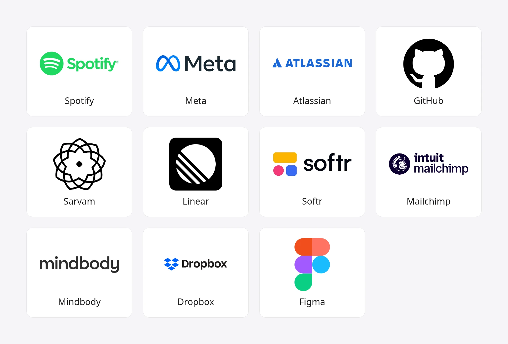
Big brands publish rules for how their logos may be used, and those rules are a decent map of what can go wrong. I read the official logo or brand pages of 11 companies on November 21, 2026, and noted three things on each: whether it states a minimum size, what it says about light and dark backgrounds, and whether it names a one-color version.
| Brand | Minimum size on the page | Light and dark backgrounds | One-color version |
|---|---|---|---|
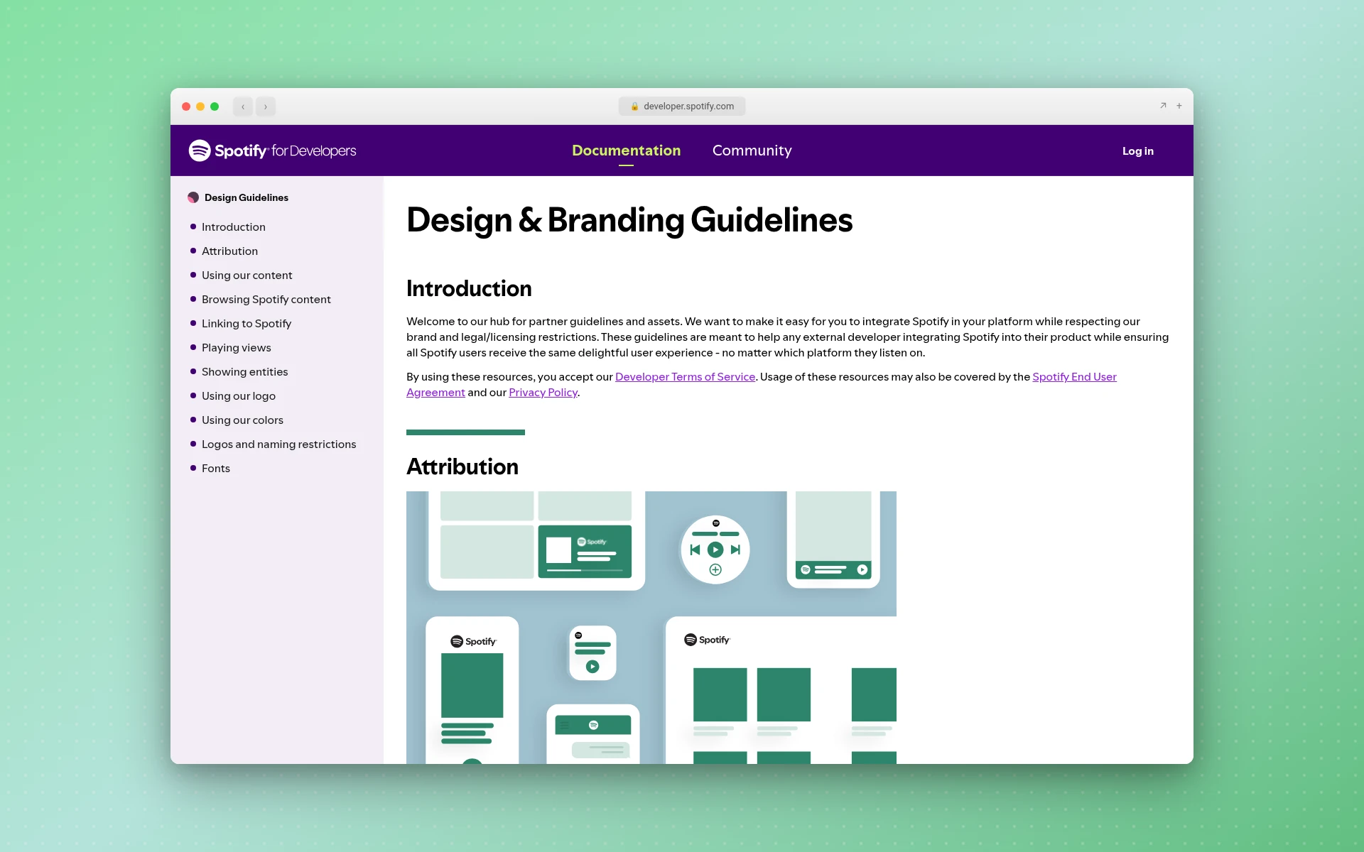
| Spotify | 70px digital, 20mm print (icon: 21px, 6mm) | Black logo on light, white logo on dark | Yes: monochrome for any other background |
| Meta | 12px or 5mm, measured by the symbol's height | Not covered on the page | Yes: mono variations, for low-quality reproduction |
| Atlassian | 280px wide, for logos with app names | Logo and program name in white on darker backgrounds | Not on the page |
| GitHub | Not stated in the text | "When in doubt, use the highest contrast option" | Yes: white, black, and in a few cases grey or green |
| Sarvam | Not stated in numbers | Wordmark black on light, white on dark | Yes: the wordmark in black and white |
| Linear | Not stated | Brand color works on light and dark | Yes: "Monochrome usage is preferred" |
| Softr | Not stated | "Use monochrome on busy background" | Yes: black and white files |
| Mailchimp | Not stated | A reverse version for dark backgrounds | Not on the page |
| Mindbody | Not stated | Not covered | Not covered |
| Dropbox | Not stated | Not covered | Not covered |
| Figma | Not stated (it points to a separate Brand Book) | Not covered | Not covered |
Three things stood out:
- Only 3 of 11 publish a minimum size. Spotify, Meta and Atlassian give numbers. The rest either keep it in a downloadable kit or don't say.
- 6 of 11 name a black, white or one-color version. For most of the brands that spell out their rules, a single-color logo is part of the system, not an afterthought.
- 3 of 11 cover none of the three on the page. Dropbox, Figma and Mindbody describe their logos but leave the usage rules to other files.
You don't need a 40-page brand book for a small business. You do need answers to the same three questions, and the steps below get you there.
Step 1: Check It Against Your Brief
Before any technical test, put the brief next to the logo and read it out loud. Does the logo fit the business you described? A playful mark for a family law firm, or a heavy industrial one for a kids' bakery, is a mismatch no amount of resizing fixes.
Ask three questions:
- Who's it for? Would your best customer see this and think it's for them?
- What should it feel like? Pick the two adjectives from your brief and check each one honestly.
- Where will it live? A logo that's mostly on Instagram has different needs from one painted on a van.
If the type is doing a lot of the work, check the font too. Some free fonts don't allow logo use, and this roundup of the best fonts for logos lists the license terms for each one.
Step 2: Shrink It to Favicon Size
A logo should still be recognizable at 16 pixels wide, the size of a browser tab icon. If it turns into a smudge there, it has too much detail. Google's own guidance says a favicon must be square and at least 8x8px, and it recommends going larger than 48x48px so it looks good everywhere (Google Search Central).
Here's the quick version of the test:
- Export the logo as a PNG and open it in a browser.
- Zoom out until it's about the size of a fingernail on your screen, then smaller.
- Look at it on your phone at arm's length.
- Squint. If the basic shape is still there with your eyes half closed, it's holding up.
Thin lines, small gaps between letters, and tiny taglines are usually the first things to vanish. That's why big brands set floors: Spotify says its logo should never go below 70px in digital and its icon never below 21px, while Meta puts its floor at 12px, measured by the symbol's height.
Does a logo need a separate small version?
Often, yes. A full logo with a name and a tagline rarely survives at 16 pixels, so many brands keep a simpler mark for app icons and social avatars. Mindbody's brand page says its standalone mark is "primarily reserved for app and social icons, or when space is extremely limited." This guide to what a logo mark is explains how the symbol and the full lockup split the work, and the app icons guide shows the small-format side.
Step 3: Flatten It to One Color
Turn the whole logo solid black on white, then solid white on black. If it still reads, the shape is strong. If it only works because of a gradient or because two colors sit next to each other, you'll find out the first time you need a rubber stamp, an embroidered shirt or a one-color invoice.
This is the check that most often sends a logo back for changes. Gradients, drop shadows and glow effects look rich on screen and disappear in one ink. Six of the 11 brand pages I read name a black, white or one-color version, and Spotify's rule is blunt: on any background other than its approved ones, "you should use a monochrome logo."
If your logo fails here, it doesn't mean starting over. Usually it means simplifying: fewer shapes, thicker strokes, and color used as an accent rather than as the thing holding the design together. The minimalist logos guide has good examples of how much a mark can lose and still work.
Step 4: Put It on Light, Dark and Busy Backgrounds
Place the logo on white, on near-black, on your main brand color, and on a busy photo. Then look at each one for a few seconds. You're checking that the logo doesn't vanish, that no part of it gets swallowed by the background, and that you know which version (full color, black or white) goes where.
The brand guides are specific about this. Spotify says the black logo goes on light backgrounds and the white logo on dark ones. Sarvam's wordmark appears in black on light backgrounds and white on dark ones. Softr's page says to "use monochrome on busy background," and GitHub's says not to place its logo over busy backgrounds at all.
Write your own version of that rule now, while you're testing. One line per background is enough: "dark backgrounds: white logo." It saves you a dozen small decisions later, and anyone who designs a flyer for you will know what to do.
Step 5: Check Contrast and Color Blindness
Accessibility rules don't force your logo to have good contrast. The Web Content Accessibility Guidelines set a 4.5:1 contrast ratio for normal text and 3:1 for large text, but they state that "text that is part of a logo or brand name has no contrast requirement" (W3C, WCAG 2.2). That exemption is a reason to check it yourself, not a pass.
A sensible bar is to treat the name in your logo like large text and aim for at least 3:1 against the backgrounds you'll use most. Any free online contrast checker will give you the ratio from two hex codes.
Then check color blindness. The National Eye Institute says about 1 in 12 men have color vision deficiency, and the most common type makes red and green hard to tell apart (NEI). If your logo relies on a red element against a green one, a lot of people may see one muddy shape. The one-color test from Step 3 catches most of this, because a logo that works in black alone doesn't depend on hue.
If you're still choosing colors, it helps to decide how many colors your brand needs first, and the color palette generator can suggest a starting set from one keyword.
Step 6: Show It to People Who Haven’t Seen It
You've stared at this logo for days, so you can't see it fresh anymore. Other people can. Show it to three to five people who don't know the backstory, for about five seconds, then take it away.
Ask them:
- What kind of business do you think this is?
- What's the name? (If they can't recall or read it, that's a legibility problem.)
- What does it remind you of?
Don't ask "do you like it?" It invites polite answers and tells you nothing about whether the logo does its job. The third question is the useful one, because it surfaces accidental resemblances: a shape that looks like another company's mark, or something unfortunate you can't unsee once someone points it out.
Pay attention to patterns, not single opinions. One person disliking the color is taste. Three people guessing the wrong industry is a real finding.
Step 7: Make Sure It Doesn’t Look Like Someone Else’s
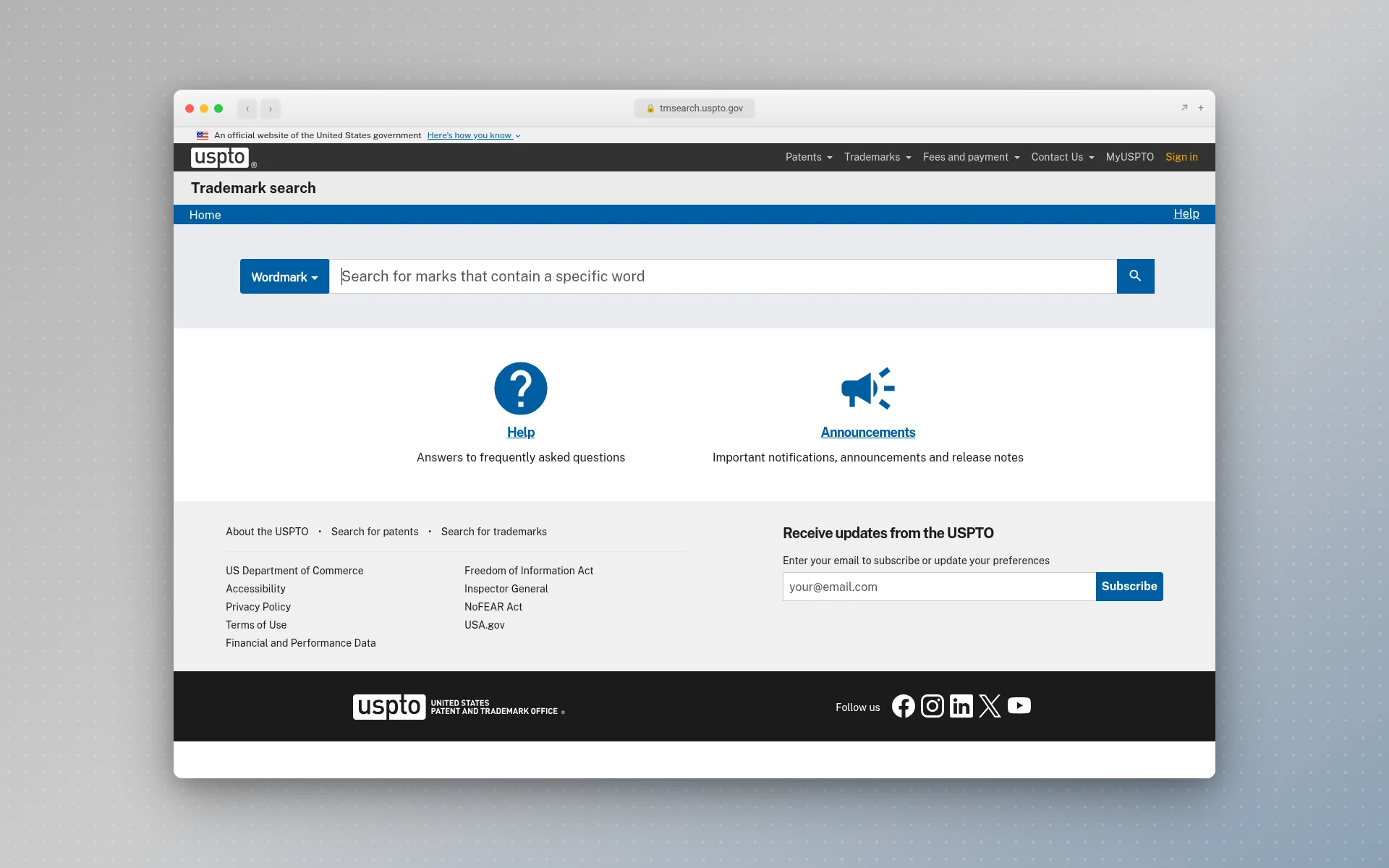
Run a reverse image search on the logo (Google Lens works) and look through the results for marks that are close to yours, especially in your own industry. Then search the US trademark records. The USPTO's Trademark Search system searches the US trademark records, and its design search codes let you look for logos by the shapes in them (USPTO).
A look-alike in a different industry is often fine. A look-alike from a competitor down the street isn't, both legally and because customers will mix you up.
This is a sanity check, not legal clearance. If you plan to register the logo, this guide on how to trademark a logo covers the search and filing steps, and the one on how to copyright a logo explains what copyright does and doesn't protect.
Step 8: Check the Files and the Rights
A finished logo is a set of files, not one image. Before you approve it and pay the last invoice, make sure you have:
- A vector master file (SVG, PDF or EPS) that scales to any size without blurring
- A transparent PNG for websites and slides. Here's how to create a transparent logo if you only got one with a white box around it.
- Black and white versions, from Step 3
- A small-size version or symbol, from Step 2
- The exact color codes (hex for screens, plus print values if you'll print)
Then check what you're allowed to do with it. A logo from a freelancer should come with a written transfer of rights. A logo from a contest site or a logo maker comes with whatever that service's terms say, and the terms can differ between plans. Read them before you put the logo on anything you sell. If price is part of the decision, this breakdown of how much a logo costs compares what you get at each level.
Common Logo Review Mistakes
These are the ones that cause the most redos:
- Reviewing only at full size. Every logo looks good on a 27-inch monitor. Always run Step 2.
- Approving the color version first. Do the black-and-white test before you fall for a gradient.
- Asking people if they like it. Ask what they think it is instead.
- Skipping the look-alike search. It takes ten minutes and can save a rebrand.
- Accepting a single PNG. Without a vector file, you'll be redrawing it the first time you need a sign.
- Reviewing alone. You're too close to it. Fresh eyes catch what you've stopped seeing.
Frequently Asked Questions
How do you test a logo?
Test it where it'll actually be used. Shrink it to about 16 pixels, flatten it to solid black and solid white, and place it on light, dark and busy backgrounds. Then show it to a few people who haven't seen it, and search for look-alikes. A logo that passes all of those is ready.
What size should a logo still work at?
Aim for about 16 pixels wide, the size of a browser tab icon, for the symbol or simplest version. Brands set their own floors: Spotify's logo never goes below 70px in digital and its icon never below 21px, and Meta's floor is 12px, measured by the symbol's height. Only 3 of the 11 brand guides I checked publish a number.
Does a logo have to work in black and white?
It should. You'll need a one-color version for stamps, embroidery, invoices and any place color printing isn't possible. Six of the 11 brand pages I read name a black, white or one-color version. If your logo only works in color, simplify the shapes until the black version reads on its own.
How do I know if my logo is too similar to another one?
Run a reverse image search and browse the results, then search the USPTO's Trademark Search system using design search codes for the shapes in your logo. Ask the people from your feedback round what it reminds them of. If a close match turns up in your industry, change the design before you launch, and see a trademark attorney if you plan to register it.
Should I use a logo maker or hire a designer?
It depends on budget and how much back-and-forth you want. A designer gives you revisions and a rights transfer. A logo maker gives you many options quickly for less money. Either way, run the same review before you commit. This comparison of the best logo makers for small business lays out the tools side by side.
Before You Sign Off
A logo review comes down to a short list: it fits the brief, it holds up at 16 pixels, it works in one color, it reads on every background you'll use, strangers can name the business, nobody else nearby owns something similar, and you have the files and rights to use it. Tick all of those and you can approve it with confidence.
If the review sends you back to the drawing board, LogoGen is one option for fresh directions: you describe your business, pick a style and colors, and it generates logo options, typically in under 10 seconds. Then put the best one through the same eight checks.