Most "best logo font" lists stop at the pretty picture. Then you set your business name in the one you like, print it on a van, and find out later the license only covered personal use. That's an expensive way to learn about font licensing.
So this list does the boring part too. On November 14, 2026, I read the license entry for each of the 11 fonts below at its source: Google Fonts' official repository for the free ones, and the Monotype and Adobe Fonts pages for the paid ones. Nine of the 11 are free to use in a commercial logo under an open license. The other two, Helvetica and Futura, need a paid license or an Adobe Fonts subscription.
TL;DR: For a free, safe default, start with Montserrat or Poppins. Want something classic? Try Playfair Display or EB Garamond. Bebas Neue is the pick for loud, all-caps signage. Pay for Helvetica or Futura only if you want their exact history, since free fonts on this list cover the same ground.
What Are the Best Fonts for Logos?
The best fonts for logos are Montserrat, Poppins, Inter, Futura, Helvetica, Bebas Neue, Playfair Display, EB Garamond, Abril Fatface, Roboto Slab and Pacifico. They stay legible at small sizes, come in enough weights to build a wordmark, and nine of them are free for commercial use under the SIL Open Font License or Apache 2.0.
A good logo font does three jobs. It reads at 16 pixels on a browser tab. It still looks like your brand on a black-and-white invoice. And it says something about the business before anyone reads the words: a geometric sans feels modern, a high-contrast serif feels expensive, and a brush script feels casual.
The 11 Logo Fonts at a Glance
Here's the full list, with the license I found for each one on November 14, 2026.
| Font | Style | Best for | License (checked Nov 14, 2026) |
|---|---|---|---|
| Montserrat | Geometric sans-serif | Startups, studios, all-purpose wordmarks | SIL Open Font License (free) |
| Poppins | Geometric sans-serif | Friendly tech and service brands | SIL Open Font License (free) |
| Inter | Neo-grotesque sans-serif | Apps and software products | SIL Open Font License (free) |
| Futura | Geometric sans-serif | Fashion, sport and design-led brands | Paid (Futura PT on Adobe Fonts) |
| Helvetica | Neo-grotesque sans-serif | Corporate and no-nonsense brands | Paid (Monotype) |
| Bebas Neue | Condensed display | Gyms, trades, events, signage | SIL Open Font License (free) |
| Playfair Display | High-contrast serif | Boutiques, editorial, hospitality | SIL Open Font License (free) |
| EB Garamond | Old-style serif | Law, publishing, heritage brands | SIL Open Font License (free) |
| Abril Fatface | Heavy Didone display | Fashion, beauty, bold editorial | SIL Open Font License (free) |
| Roboto Slab | Slab serif | Construction, coffee, workwear | Apache License 2.0 (free) |
| Pacifico | Brush script | Cafés, surf, food trucks, kids' brands | SIL Open Font License (free) |
1. Montserrat
Montserrat is the font I'd hand to anyone who says "I just want it to look clean." It's a geometric sans-serif with wide, round letters, and it has a backstory you can actually use. According to its Google Fonts description, designer Julieta Ulanovsky was inspired by "the old posters and signs in the traditional Montserrat neighborhood of Buenos Aires."
Key features:
- Nine weights, from Thin (100) to Black (900), each with a matching italic
- Wide letterforms that stay readable when you shrink the logo
- Designed by Julieta Ulanovsky, Sol Matas, Juan Pablo del Peral and Jacques Le Bailly
License: SIL Open Font License, per its metadata file. Free for logos.
Best for: startups, creative studios and anyone building a simple wordmark logo. The heavy weights in all caps make a strong sign. The light weights look elegant but can disappear on a small screen, so test them small.
2. Poppins
Poppins is Montserrat's friendlier cousin. Its letters are built on circles and straight lines, so the "o" is close to a perfect ring and the whole word feels soft. It was made by the Indian Type Foundry, and it supports both Latin and Devanagari, which is rare for a free geometric font.
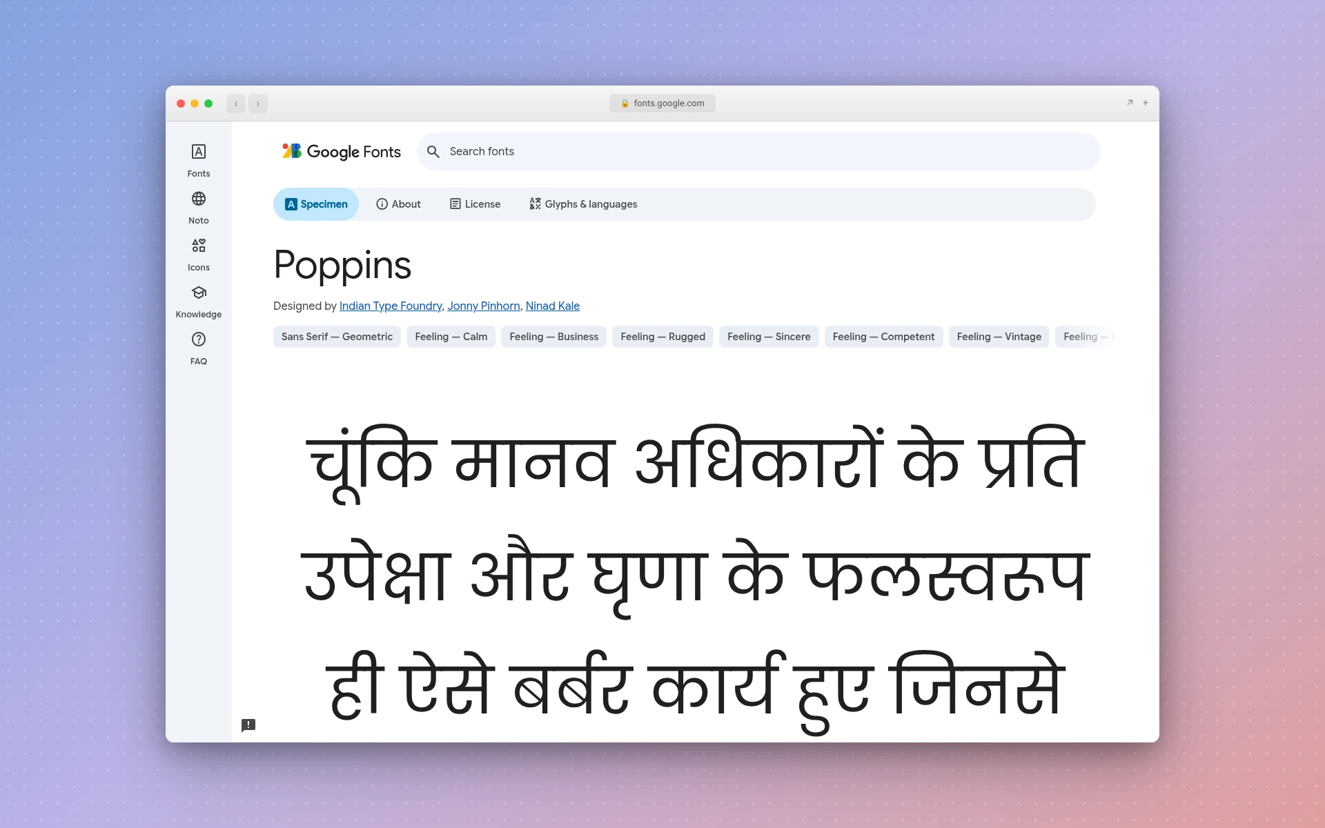
Key features:
- Nine weights, each with an italic, so you can find the exact heaviness you want
- Round, even shapes that look good in a single color
- Latin and Devanagari in one family
License: SIL Open Font License, per its Google Fonts listing. Free for logos.
Best for: tech startups, agencies and service businesses that want to look approachable. If you like the look of modern logos, Poppins in a semibold weight is a safe place to start.
3. Inter
Inter was drawn by Rasmus Andersson, and its own description calls it a family "carefully crafted & designed for computer screens." That focus shows in the tall lowercase letters, which stay clear at tiny sizes. It's less of a statement than the other sans-serifs here, and that's the point.
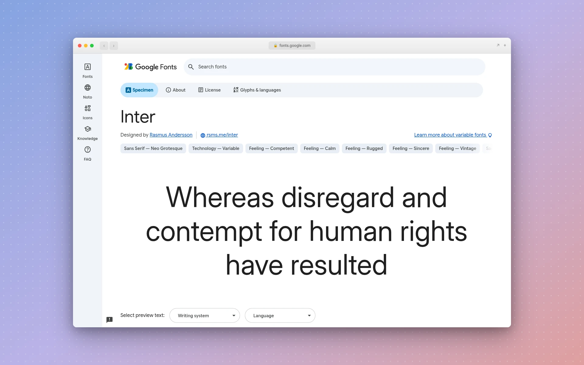
Key features:
- A variable weight range from 100 to 900
- An optical size axis (14 to 32), so the letters adjust slightly for small and large use
- A tall x-height that keeps lowercase text legible on screens
License: SIL Open Font License, per its Google Fonts listing. Free for logos.
Best for: apps and software brands whose logo lives mostly on screens and in app stores. Because Inter is so neutral, it pairs well with a symbol. Pair it with an icon and you'll get a clean combination mark (see what a logo mark is if that term is new).
4. Futura
Futura is nearly a hundred years old and still turns up everywhere. Paul Renner designed it, and it "immediately became popular upon its release by the Bauer Type Foundry in 1927," according to AIGA's Eye on Design. The same article says it's "the font in ads and logos for everyone from Nike and Volkswagen to the Pittsburgh Steelers," and that it was engraved on the plaque attached to the lunar module in 1969.
Key features:
- Strict geometric shapes: circular o's, sharp pointed A's and M's
- Long ascenders on letters like "b" and "d" that give a lowercase wordmark presence
- A long track record in fashion, sport and design branding
License: Paid. Adobe Fonts carries Futura PT from Paratype, and the page says "the full Adobe Fonts library is cleared for both personal and commercial use." Self-hosting it or embedding it in an app needs a license bought from Paratype.
Best for: brands that want a design-literate, slightly fashion-forward look. If you don't have Creative Cloud, Montserrat and Poppins give you a similar geometric feel for free.
5. Helvetica
Helvetica is the default answer to "what font do corporate logos use?" for a reason. Fonts In Use dates it to 1957, when it was first shown as Neue Haas Grotesk, designed by Max Miedinger with art direction by Eduard Hoffmann. Linotype released it under the Helvetica name in 1960.
Key features:
- Tight, even spacing that makes short names look solid
- Plain, unfussy shapes that let a symbol or color do the talking
- A modern update, Helvetica Now, in three optical sizes: Micro, Text and Display
License: Paid. Monotype sells Helvetica Now desktop fonts through MyFonts, and offers bespoke licensing for brands. On Adobe Fonts you'll find Neue Haas Grotesk, the name the design first shipped under, and Adobe says its library is cleared for commercial use.
Best for: professional services and brands that want to look neutral and established. Is Helvetica free? No. If a site offers it as a free download, that's a red flag. Inter is the closest free stand-in on this list.
6. Bebas Neue
Tall, narrow and all caps, Bebas Neue is a display font by Ryoichi Tsunekawa. Its own description calls it "a display family suitable for headlines, captions, and packaging." It's the font you see on gym walls, festival posters and the side of a contractor's truck.
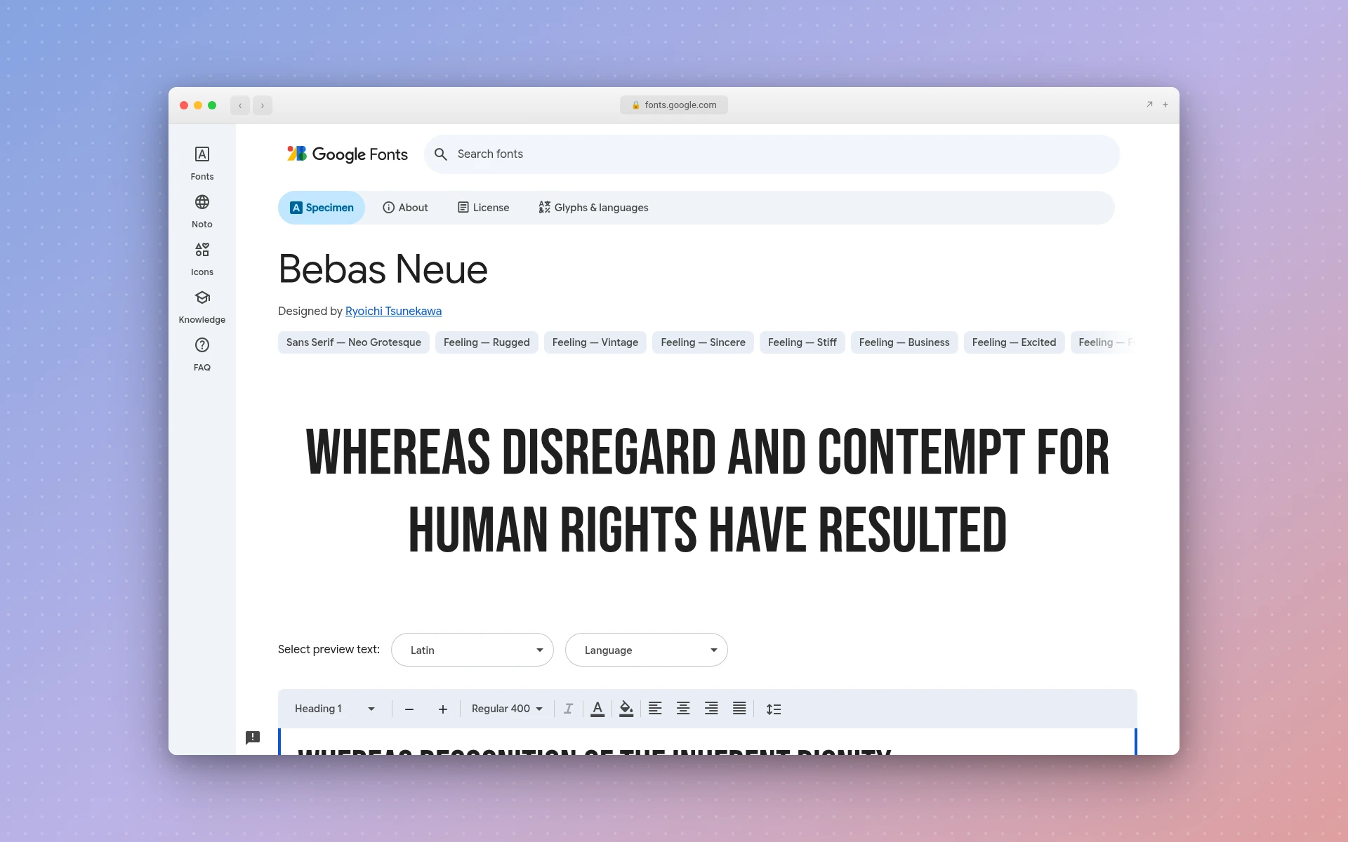
Key features:
- Capitals only, so every word reads as a headline
- Condensed letters fit a long name into a narrow space
- One weight, which keeps choices simple
License: SIL Open Font License, per its Google Fonts listing. Free for logos.
Best for: fitness, trades, events and anything that lives on signs and merch. The nine construction logos we looked at mostly lean on heavy, upright capitals like these. Bebas Neue is everywhere, though, so pair it with a distinct symbol or color so you don't blend in.
7. Playfair Display
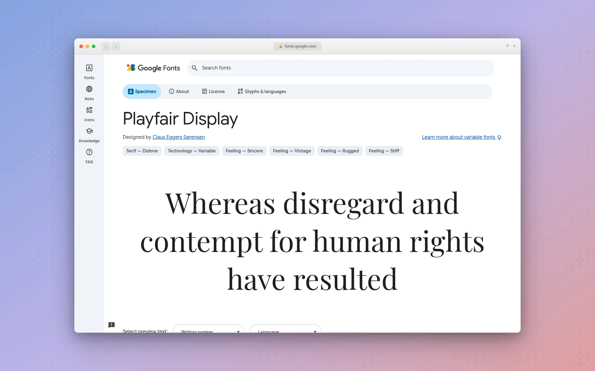
Playfair Display is the go-to free serif when you want a logo to feel a bit more expensive. Designer Claus Eggers Sørensen says it isn't a revival of any one typeface but "takes influence from the designs of John Baskerville and from 'Scotch Roman' designs," with high contrast between thick and thin strokes.
Key features:
- Weights from Regular (400) to Black (900)
- Sharp, high-contrast strokes that look refined at large sizes
- Built as a display face, meant for big text rather than paragraphs
License: SIL Open Font License, per its Google Fonts listing. Free for logos.
Best for: boutiques, restaurants, hotels and editorial brands. Those thin hairlines can break up when you embroider a logo or shrink it to a favicon. Use a bolder weight, or keep a simpler monogram for the small spots.
8. EB Garamond
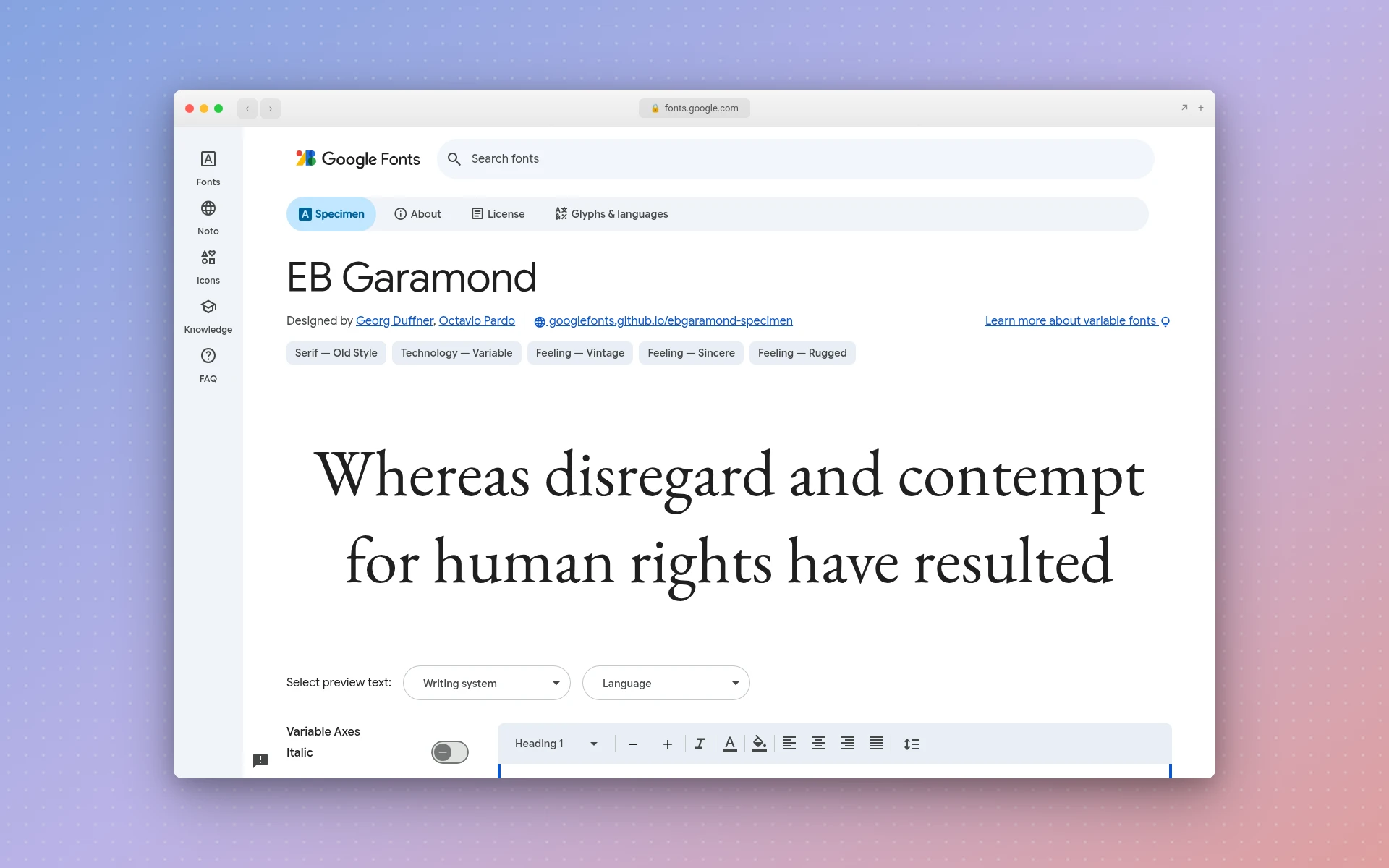
Garamond is about as classic as type gets, and EB Garamond is a free, faithful version of it. Its description calls it "a community project to create a revival of Claude Garamont's famous humanist typefaces from the mid-16th century," drawn from a type specimen printed in 1592.
Key features:
- Weights from Regular (400) to ExtraBold (800)
- Soft, calligraphic serifs with a warm, bookish feel
- Low contrast compared with Playfair, so it holds up better at small sizes
License: SIL Open Font License, per its Google Fonts listing. Free for logos.
Best for: law firms, publishers, consultants and heritage brands that want to look trustworthy without looking stiff. It also works as a quiet second font under a bolder name.
9. Abril Fatface
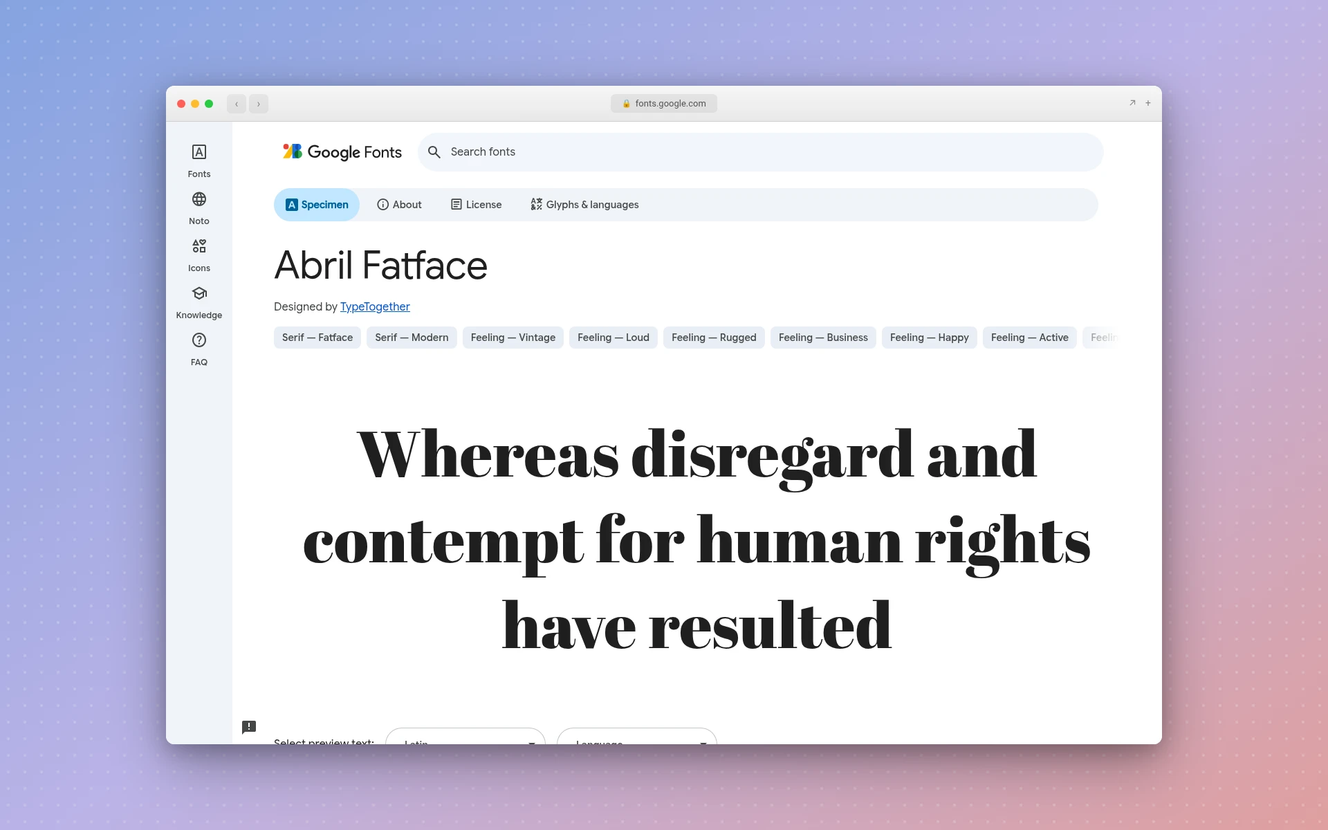
The TypeTogether foundry made Abril Fatface heavy and dramatic on purpose. Its description says it's "inspired by the heavy titling fonts used in advertising posters in 19th century Britain and France," a "contemporary revamp of classic Didone styles." Think of the giant letters on a fashion magazine cover.
Key features:
- Extremely thick vertical strokes next to hairline-thin ones
- One heavy weight made for big, short words
- Instant fashion and beauty associations
License: SIL Open Font License, per its Google Fonts listing. Free for logos.
Best for: salons, beauty brands, fashion labels and bold editorial projects. Keep the name short. Long names in Abril get heavy fast.
10. Roboto Slab
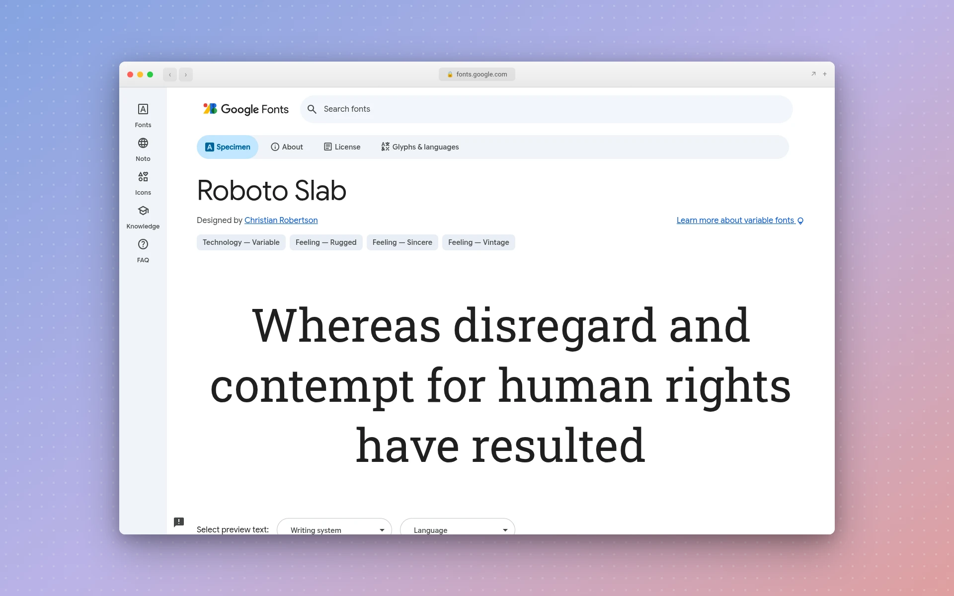
Roboto Slab adds thick, square serifs to the shapes of Roboto. Its description says Roboto "has a mechanical skeleton and the forms are largely geometric" with "friendly and open curves." The slabs make it sturdy, the kind of type you'd expect stamped on a crate.
Key features:
- A full weight range from 100 to 900
- Block serifs that survive rough printing, vinyl and embroidery
- A sturdy, workmanlike tone that isn't as harsh as a condensed sans
License: Apache License 2.0, per its Google Fonts listing. The Apache license grants a "perpetual, worldwide, non-exclusive, no-charge, royalty-free, irrevocable" copyright license, so it's free for logos too.
Best for: construction, coffee roasters, workwear and craft brands. It also suits retro logos that borrow from old shop signs.
11. Pacifico
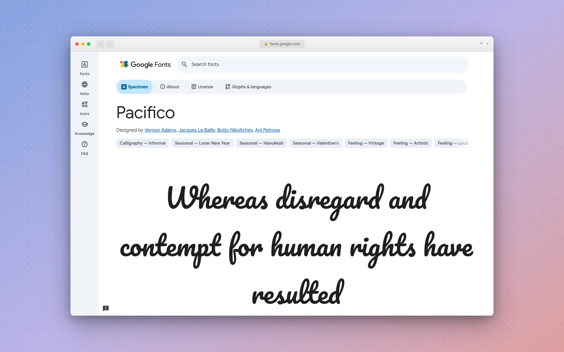
Vernon Adams drew Pacifico, and its listing calls it "an original and fun brush script handwriting font" inspired by "the 1950s American surf culture." It's loose and cheerful, and nobody will mistake it for a bank.
Key features:
- Connected, brushy letters that feel handmade
- Thick strokes, so it stays readable better than thin scripts
- One weight
License: SIL Open Font License, per its Google Fonts listing. Free for logos.
Best for: cafés, ice cream shops, surf and beach brands, and kids' products. Script fonts get hard to read in all caps and at small sizes, so write the name in mixed case and test it as a social media avatar.
Can You Use Google Fonts in a Logo?
Yes, for the eight OFL fonts on this list and any other font released under the SIL Open Font License. The license's own FAQ answers the question of using OFL fonts for logos directly: "Yes. You are very welcome to do so." It also confirms that you "remain the author and copyright holder" of the logo you make with the font.
The OFL FAQ lists "logos, posters, business cards, stationery, video titling, signage" as examples of allowed uses. What you can't do is sell the font file by itself. Roboto Slab uses Apache 2.0 instead, which is also free for commercial work.
Two things to know before you commit:
- Free to use isn't the same as exclusive. Anyone else can set their logo in Montserrat too. That's why most good wordmarks customize the font a little.
- The font license and the trademark are separate questions. A free font doesn't stop you from registering your logo, and it doesn't protect you from someone else's mark. The guide on how to trademark your logo explains the filing side.
Be careful with free-font sites outside Google Fonts. As the band logo guide points out, many of them offer fonts with personal-use-only terms, and a logo is commercial use the moment it's on something you sell.
How Many Fonts Should a Logo Have?
A logo should usually use one font, and two at most. One font for the name keeps the logo simple and easy to reproduce. If you add a tagline, a second, quieter font (a light sans under a bold serif, for example) can separate it from the name without competing.
Three or more fonts almost always look messy at small sizes. A cleaner trick is to use one family in two weights: Montserrat Black for the name, Montserrat Regular for the tagline. You get contrast without a second personality. The same "fewer is better" rule applies to color, and this guide on how many colors a brand needs covers that side.
Serif or Sans-Serif: Which Logo Fonts Work Better?
Neither is better across the board. Sans-serif logo fonts like Montserrat and Inter read as modern and hold up well on screens, which is why tech and service brands favor them. Serif fonts like Playfair Display and EB Garamond read as established and premium, which suits hospitality, law and fashion.
A quick way to choose:
- Pick a geometric sans (Montserrat, Poppins, Futura) if you want clean and current.
- Pick a neutral sans (Inter, Helvetica) if a symbol or color will carry the brand.
- Pick a serif (Playfair Display, EB Garamond, Abril Fatface) if you want trust or luxury.
- Pick a slab or condensed display (Roboto Slab, Bebas Neue) if the logo lives on signs and trucks.
- Pick a script (Pacifico) if the brand is casual and personal.
For more on how type choices play out in real brands, browse these logo examples from famous brands, sorted by logo type. And if you want a logo that's almost all type, the minimalist logos guide shows how far you can strip a design back.
How We Chose
On November 14, 2026, we started from the fonts that the top-ranking "best fonts for logos" guides recommend, then kept the ones that cover each major style: geometric sans, neutral sans, condensed display, high-contrast serif, old-style serif, slab and script. For every font, we read its license and design notes at the source:
- Free fonts: the metadata and description files in Google Fonts' official repository on GitHub, which list each font's license, designers and weights.
- Paid fonts: Monotype's Helvetica Now page and the Adobe Fonts pages for Futura PT and Neue Haas Grotesk.
- History and usage claims: Fonts In Use for Helvetica and AIGA's Eye on Design for Futura.
We left out fonts whose origin or license we couldn't confirm at a primary source on that date. That's why some names you'll see in other lists, like Gotham, aren't here. The result: 9 of the 11 fonts are free for logo use under an open license, and 2 need a paid license.
We didn't set test logos in each font. The "best for" notes come from each font's shapes and its designers' own descriptions.
Frequently Asked Questions
What is the best font for a logo?
There's no single best font, but Montserrat is the safest free starting point: it's clean, comes in nine weights with italics, and its open license allows logo use. If you want something more classic, Playfair Display is the free serif to try. Pick the font that matches how you want the brand to feel, then test it at favicon size.
Is Helvetica free for logos?
No. Helvetica is a commercial typeface from Monotype, sold through MyFonts, with bespoke licensing for brands. Adobe Fonts subscribers can use Neue Haas Grotesk, the name it was first shown under in 1957. If you want a free neutral sans-serif instead, Inter is the closest option on this list.
What font does Nike use?
According to AIGA's Eye on Design, Futura has appeared in ads and logos for Nike, along with Volkswagen and the Pittsburgh Steelers. Futura is a paid font, available through Adobe Fonts as Futura PT. For a similar geometric look at no cost, try Montserrat or Poppins.
Can I modify a free font for my logo?
Generally, yes. Most designers type the name in a font, convert the letters to outlines, then adjust spacing or reshape a letter or two. The OFL FAQ says you stay the copyright holder of the artwork you make with an OFL font. The Illustrator logo tutorial walks through outlining text step by step.
What are logo fonts called?
People use "logo font" for any typeface set in a logo, but designers split them by style: sans-serif, serif, slab serif, script and display. A logo made only of a styled name is called a wordmark or logotype. One made of initials is a lettermark, or monogram.
Where to Go From Here
Pick one font from the style that fits your brand, set the name in two or three weights, and test it small before you decide. Settle the name first, too, since a font that looks great on one name can look awkward on another. The business name generator helps if you're still choosing, and the color palette generator gives you colors to try alongside the type.
If you'd rather see finished logo ideas before you start choosing type, LogoGen is one option: you describe your business, pick a style and colors, and it generates logos, typically in under 10 seconds.