Search for construction logo ideas and you'll get page after page of the same templates: a hammer crossed with a wrench, a roofline over a house, a crane hook, a hard hat. They look like construction. They also look like every other contractor in your town.
So I went the other way. On November 6, 2026, I lined up the official logos of nine of the best-known names in construction, from equipment makers like Caterpillar and JCB to contractors like Bechtel, Turner and Skanska, and noted what each one is actually built from. None of the nine uses a hammer, a crane, a house or a hard hat. Every one of them spells out the company name or its initials, and five add no symbol at all.
Below you'll find each logo with the sourced story behind it, the patterns they share, a table of ideas by type of contractor, and a short process for making your own construction business logo.
What Makes a Good Construction Logo?
A good construction logo is one your name can carry on its own: bold, simple letters in one or two strong colors, readable from across a job site and on the side of a truck. The best-known construction logos add one graphic element at most, such as a small triangle or a seal, and skip literal tool icons.
In practice, that means a construction company logo has to pass three tests the average café logo never faces:
- The truck door test. Can someone read it at 40 feet while it drives past?
- The hard hat test. Does it still work as a small sticker on a curved helmet?
- The one-color test. Will it survive being screen-printed in white on a dark work shirt, or stenciled on a site fence?
Bold type passes all three. Fine illustrations of cranes and tools usually fail at least one.
9 Construction Logos at a Glance
Here are the nine official logos I looked at, in the order of the table below.
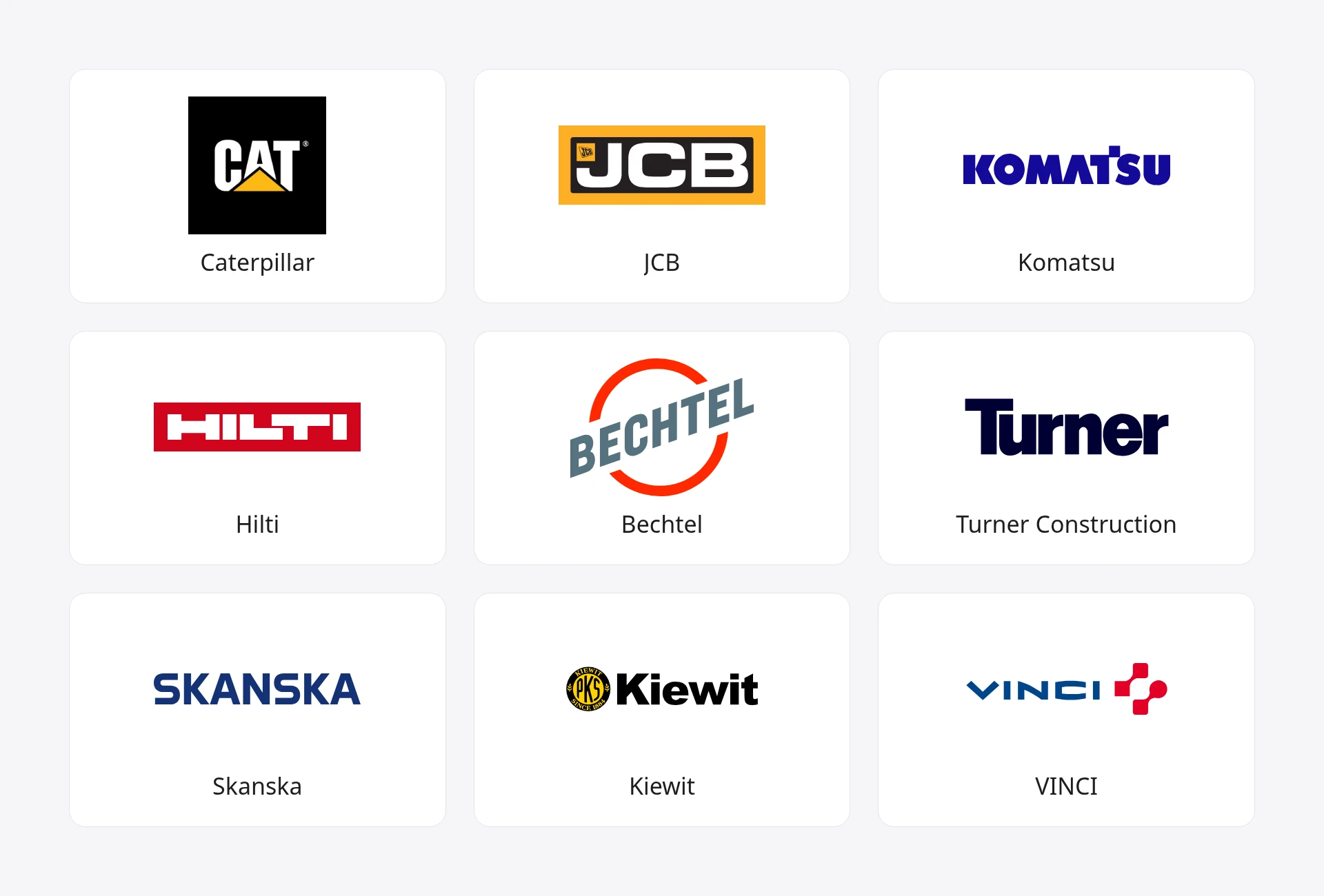
| Brand | What the logo is built from | Colors | Founded |
|---|---|---|---|
| Caterpillar | "CAT" plus a triangle under the A | Black, white, yellow | 1925 (merger) |
| JCB | Initials in a framed box | Yellow, black, white | 1945 |
| Komatsu | Name only, with a custom T | Blue | 1921 |
| Hilti | Name inside a red block | Red, white | 1941 |
| Bechtel | Slanted name across a circle | Gray, red | 1898 |
| Turner Construction | Name only, tightly set | Navy | 1902 |
| Skanska | Name only, in capitals | Blue | 1887 |
| Kiewit | Name plus a round seal | Black, yellow | 1884 |
| VINCI | Name plus a connector symbol | Blue, red | 1899 |
A note on method: the "built from" and "colors" columns are what I saw in each company's current official logo. The founding years come from the linked sources. Caterpillar's year is the 1925 merger of Holt and Best, which created the company under that name.
The 9 Logos, One by One
1. Caterpillar: One Shape and a Color You Can Own
Cat's logo is three heavy letters with a yellow triangle tucked under the A. The triangle came late: according to SlashGear's history of the brand, it was added under the first "a" in 1989.
The color came much earlier. SlashGear reports that by 1931 Caterpillar was developing what it called "Hi-Way Yellow," a brighter paint that made its big machines easier to see on the road. That's a practical reason for a color, and it's why yellow now reads as "construction" to most people.
Borrow it if: you can claim one color in your area and paint it on everything you own. Then add one small shape that lives inside your name, not beside it.
2. JCB: Initials in a Box
JCB's logo is the founder's initials in thick, squared-off letters, framed in black and yellow. Joseph Cyril Bamford started the company in October 1945, and Wikipedia's history of JCB notes that a year later he began painting his products yellow. The same page credits the logo's design to advertising designer Leslie Smith.
Borrow it if: your company carries a long family name, or a name like "Smith & Sons General Contracting" that won't fit on a hard hat. Two or three initials in a solid frame stamp well on equipment and tool cases. The monogram logos guide shows how to set initials so they read as one unit.
3. Komatsu: Let One Letter Do the Work
Komatsu's logo is the name in heavy blue capitals, with a small cut at the top of the T. The company's own history page says the unique design of the letter "T" and its "deep, vivid Gloria Blue colour" stand for a bold corporate character, and that the logo reflects "reliability, stability, and strength."
The first Komatsu logo was quite different. The same page says it was designed from the letter Ko (小), meaning small, and kept its "little pine tree" look until the late 1990s.
Borrow it if: you want a type-only logo with a hook. Change one letter (a notch, a stencil break) and leave the rest alone. The wordmark logos page covers how to adjust a typeface without wrecking it.
4. Hilti: Put the Name on a Solid Block
Hilti, the power tool maker that Martin and Eugen Hilti founded in Schaan, Liechtenstein, in 1941 (Hilti Group), uses white capitals knocked out of a red rectangle. It has no separate symbol. The red block does that job.
A solid block of color carries its own background with it, so the name never gets lost on plywood or a muddy truck. Borrow it if your logo will mostly live on stickers, decals and busy photos.
5. Bechtel: Keep the Shape, Sharpen the Name
Bechtel's logo slants the name in bold gray letters across an open red circle. When the company introduced it on February 2, 2023, its press release called it "the first substantive update to the company's logo since 1947" and described the new design as "sharper, modern, and more dynamic." Bechtel was founded in 1898.
The lesson there is restraint. Chermayeff & Geismar & Haviv, the design firm behind the update, says the new mark modernizes the name while "maintaining the shape and footprint of the original mark created in 1947."
Borrow it if: you already have a logo customers know. You don't have to start over.
6. Turner Construction: A Name Set Tight and Heavy
Turner's logo is just "Turner" in very heavy navy type, with the letters packed close together. Henry Chandlee Turner founded the company in New York in 1902 with $25,000 in start-up capital, according to Wikipedia, and it went on to build the United Nations Secretariat Building and Madison Square Garden.
Borrow it if: you're a general contractor whose name is short. A general contractor logo doesn't need to show a trade, because you manage all of them. Heavy, tightly spaced type looks solid and reads from a distance, which is most of the job.
7. Skanska: Plain Capitals, One Color
Skanska's logo is the name in wide blue capitals and nothing else. The company's history goes back to 1887, when Rudolf Fredrik Berg founded it as Aktiebolaget Skånska Cementgjuteriet, a cement products business. "In 1984, Skanska became our official name," the company says on its history page.
One color, one typeface, all caps: it's the cheapest logo to reproduce, and it never looks dated because there's nothing to date it. Borrow it if you want the calmest option on this list.
8. Kiewit: Add a Founding-Year Seal
Kiewit pairs a bold black wordmark with a small round yellow seal that holds the letters PKS and the words "since 1884." Those initials echo Peter Kiewit Sons', the name the firm took when it reorganized in 1931. Its roots are older still: "Peter and Andrew Kiewit formed Kiewit Brothers in 1884 as a masonry contractor, focusing on bricklaying in Omaha," per Kiewit's own history.
Borrow it if: your business has been around a while, or you want it to feel that way. A round seal with your initials and founding year makes a good embroidered patch.
9. VINCI: A Symbol With a Building Story
VINCI's logo is its name in blue with a red symbol beside it. That symbol has a real construction story behind it: "The VINCI logo comprises connectors once used in the construction of cathedrals to bind the stones together," the company explains on its history page. The name itself honors Leonardo da Vinci, and the group took it in 2000, when the SGE and GTM merger "resulted in the birth of VINCI." SGE dates back to 1899.
Want a symbol that isn't a cliché? Look for a detail from your own trade that outsiders don't see as an icon yet, like a rebar tie or a mortise joint. Draw it simply and put it next to your name.
What the 9 Logos Have in Common
Looking at the nine official logos side by side, a few patterns are hard to miss:
- All nine spell out a name or initials. Five (JCB, Komatsu, Hilti, Turner and Skanska) add no symbol: just letters, two of them set in a frame or a color block. The other four add exactly one graphic element: Cat's triangle, Bechtel's circle, Kiewit's seal and VINCI's connectors.
- None uses a literal construction icon. Zero hammers, cranes, roofs, houses or hard hats. The one symbol with a building meaning, VINCI's connectors, is something most people wouldn't recognize as a tool at all.
- Nobody uses more than three colors. Three of the nine are a single color. Yellow shows up in three (Cat, JCB and Kiewit), blue or navy in four, and red in three.
- The letters are heavy. Thin, elegant type doesn't appear once. These logos are meant to be read from a distance.
That second point is the useful one for a small firm. The template sites push tools and rooftops because those images say "construction" fast. The biggest names in the industry show you don't need them. If you'd like more context on how a symbol differs from a full logo, see the explainer on what a logo mark is, or browse logo examples from famous brands outside construction.
Construction Logo Ideas by Type of Contractor
Here's how I'd match the ideas above to different kinds of construction business. These are starting points, not rules.
| Type of business | Logo ideas that usually fit | Why |
|---|---|---|
| General contractor | Heavy name only (Turner), initials in a box (JCB) | You run every trade, so the name is the brand |
| Builder or home builder | Name plus one shape (Cat), name on a block (Hilti) | Has to read on yard signs in front of finished homes |
| Excavation or earthmoving | Initials in a box (JCB), one signature color (Cat) | Lives on machines, so it needs to be blunt and bold |
| Roofing, framing or carpentry | A symbol from the trade (VINCI), a custom letter (Komatsu) | A joint or a beam detail beats another roofline |
| Concrete or masonry | A founding-year seal (Kiewit), plain capitals (Skanska) | Stamps well on paperwork and drawings |
| Remodeling and renovation | Reworked name with a kept shape (Bechtel) | Feels established without looking old |
| Electrical or plumbing | Name plus one small shape | A spark or a drop, used sparingly, is enough |
If you run a small trade business rather than a big contractor, the logo ideas for small business post covers seven more starting points from brands that began with a single shed or cart.
What Colors Work Best for a Construction Logo?
Yellow, black, blue and red are the safest colors for a construction logo. Yellow and black tend to read as heavy equipment and site safety, while blue feels dependable and corporate, and red adds urgency. Pick one main color and at most one accent, and make sure the logo also works in plain black or white.
Among the nine logos, the split is telling. Three of the four equipment and tool makers (Cat, JCB and Hilti) lean on loud yellow and red, and Komatsu, with its single blue, is the exception. The big contractors (Turner, Skanska, Bechtel and VINCI) lean on blue, navy and gray, which suits logos that mostly appear on bids and office towers.
Think about where your logo will spend most of its life. If it's on trucks and equipment, go bright. If it's on proposals for commercial clients, a deep blue or gray will feel more at home. For help deciding how many colors to use, see how many colors a brand should have, or browse a color palette generator for combinations.
What Font Should a Construction Logo Use?
A construction logo should use a heavy sans-serif font: bold, wide or condensed letters with even strokes and no thin details. That's what all nine logos above have in common. Avoid script fonts, thin serifs and anything decorative, because they break down on a vinyl decal or an embroidered shirt.
A few practical tips:
- Go bolder than you think. A weight that looks heavy on screen often looks normal on the side of a truck.
- Try capitals and title case. Skanska and Komatsu use all caps, Turner and Kiewit use title case. Both work if the weight is heavy.
- Tighten the spacing. Close-set letters, like Turner's, look solid. Wide gaps look flimsy at a distance.
- Customize one letter. Komatsu's T shows how one small change can make a common font your own.
How to Design Your Own Construction Logo
The quickest path to a construction logo is to settle your name, set it in a heavy sans-serif, then decide whether it needs one extra element: a color block, a seal or a symbol from your trade.
Here's the process I'd follow:
- Lock in the name. A logo built around a name you later change is wasted money, and depending on how much your logo costs, that can add up. If you're still choosing, see the business name generator.
- Pick your idea from the nine. Name only, initials in a box, a block of color, a seal or a symbol from your trade. Use the contractor table above to narrow it down.
- Sketch it on paper first. Ten quick versions in ten minutes. The guide to drawing a logo walks through turning a sketch into a clean vector.
- Test the truck door, the hard hat and one color. Shrink it to sticker size, then print it in black only. If it blurs or turns into a blob, simplify.
- Choose colors last. Start in black, then add your main color, and at most one accent.
- Check it isn't taken. The US Patent and Trademark Office says a trademark "can be any word, phrase, symbol, design, or a combination of these things that identifies your goods or services" (USPTO). Search before you print a single truck wrap.
- Export the files you'll need. A vector for signs and vehicles, and a version with a transparent background for your website and bids. The transparent logo guide covers that step.
Frequently Asked Questions
Should a construction logo include a hammer, crane or house?
It doesn't need to, and none of the nine logos on this page does. Tool and roof icons are so common in construction that they make you look like everyone else. A bold name, your initials or one detail from your trade is more memorable and easier to reproduce on vehicles and gear.
What should a construction company logo include?
At minimum, your company name in heavy, readable letters. Many strong construction logos add one more element: a color block like Hilti's, a seal like Kiewit's or a simple symbol like VINCI's connectors. Skip taglines, phone numbers and long service lists. Those belong on the truck, not in the logo.
What is a good general contractor logo?
A good general contractor logo puts the company name first, because a general contractor covers many trades and no single icon fits them all. Turner Construction is a good model: just the name in heavy, tightly spaced type. If the name is long, initials in a solid frame, like JCB's, work well.
How much does a construction logo cost?
It depends on who makes it. You can sketch one yourself for the cost of your time, use a logo maker, or hire a freelancer or agency for a custom design. Prices vary widely, and the breakdown of what a logo costs compares the main options.
Can I use yellow and black like Caterpillar?
Plenty of construction businesses use yellow and black, and Kiewit's seal and JCB's frame both do. What you shouldn't do is copy Cat's triangle, its letter shapes or its overall look. A trademark can cover a symbol or design as well as a name, so search the USPTO's records and talk to a trademark attorney before you pay for signs and vehicle wraps.
Where to Go From Here
The nine construction logos on this page come down to one idea: let the name do the heavy lifting. Set it in bold type, add one shape or color you can own, and make sure it reads from a truck door and in a single color.
If you'd like to see a few directions before you sketch, LogoGen is one option: you describe your business, pick a style and colors, and it generates logo options, typically in under 10 seconds. Or go back to the nine examples above and pick the one idea that fits your crew.