Most lists of brand color palette examples give you a logo, a few color names and a guess at what they mean. That's fine for a mood board. It's no help when you need an actual code to type into a design file.
So I went to the source. On November 5, 2026, I read the official color pages of 11 organizations, from GitHub and the NHS to a UK law firm, and copied the hex codes they print themselves.
Then I ran each lead color through the WCAG contrast formula against a white background. Only 7 of the 11 reach the 4.5:1 ratio that normal-size text needs. The other four are still good palettes, and how they handle that gap is one of the most useful things you can borrow.
What Are Some Good Brand Color Palette Examples?
Good brand color palette examples include GitHub's single green with grays, Discord's blurple with a pale tint and black, Ubuntu's orange and aubergines, and WWF's black and white with nature colors. Each one pairs a clear lead with neutrals for text and backgrounds, and each guide publishes its codes.
A brand color palette is just the fixed set of colors an organization agrees to use, usually with a lead color, one or more supporting colors and some neutrals. If you're not sure how big yours should be, I've covered how many colors a brand needs separately. This page is about what real ones look like.
The 11 Palettes at a Glance
Every code here came from the organization's own page, not a color-code site. The contrast figures are my own calculation, using the formula from the WCAG contrast standard, for each lead color on white.
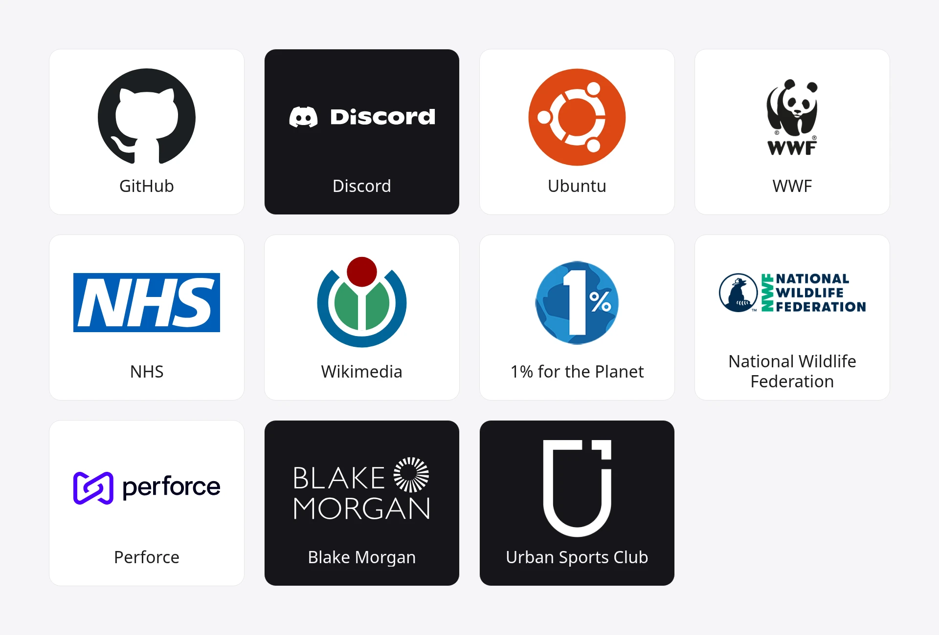
| Brand | Lead color | Contrast on white | Type |
|---|---|---|---|
| GitHub | GitHub Green #0FBF3E |
2.5:1 | Software |
| Discord | Blurple #5865F2 |
4.6:1 | Software |
| Ubuntu | Orange #E95420 |
3.7:1 | Software |
| WWF | Black #000000 |
21:1 | Nonprofit |
| NHS | Blue #005EB8 |
6.4:1 | Healthcare |
| Wikimedia | Black #000000 |
21:1 | Nonprofit |
| 1% for the Planet | Pacific Blue #1791D1 |
3.5:1 | Nonprofit |
| National Wildlife Federation | Ocean Blue #003057 |
13.5:1 | Nonprofit |
| Perforce | Indigo #4C00FF |
7.6:1 | Software |
| Blake Morgan | Purple #340F53 |
15.7:1 | Law firm |
| Urban Sports Club | Sophisticated Yellow #F6F0A8 |
1.2:1 | Fitness |
WCAG asks for at least 4.5:1 for normal text and 3:1 for large text. Text inside a logo is exempt, so a low number here doesn't mean a bad logo. It tells you the color can't carry your paragraphs.
11 Brand Color Palette Examples, One by One
Some of these guides list dozens of colors, so I've picked the ones that show the palette's structure. Follow each brand's link for the rest.
1. GitHub: One Green, a Lot of Neutrals
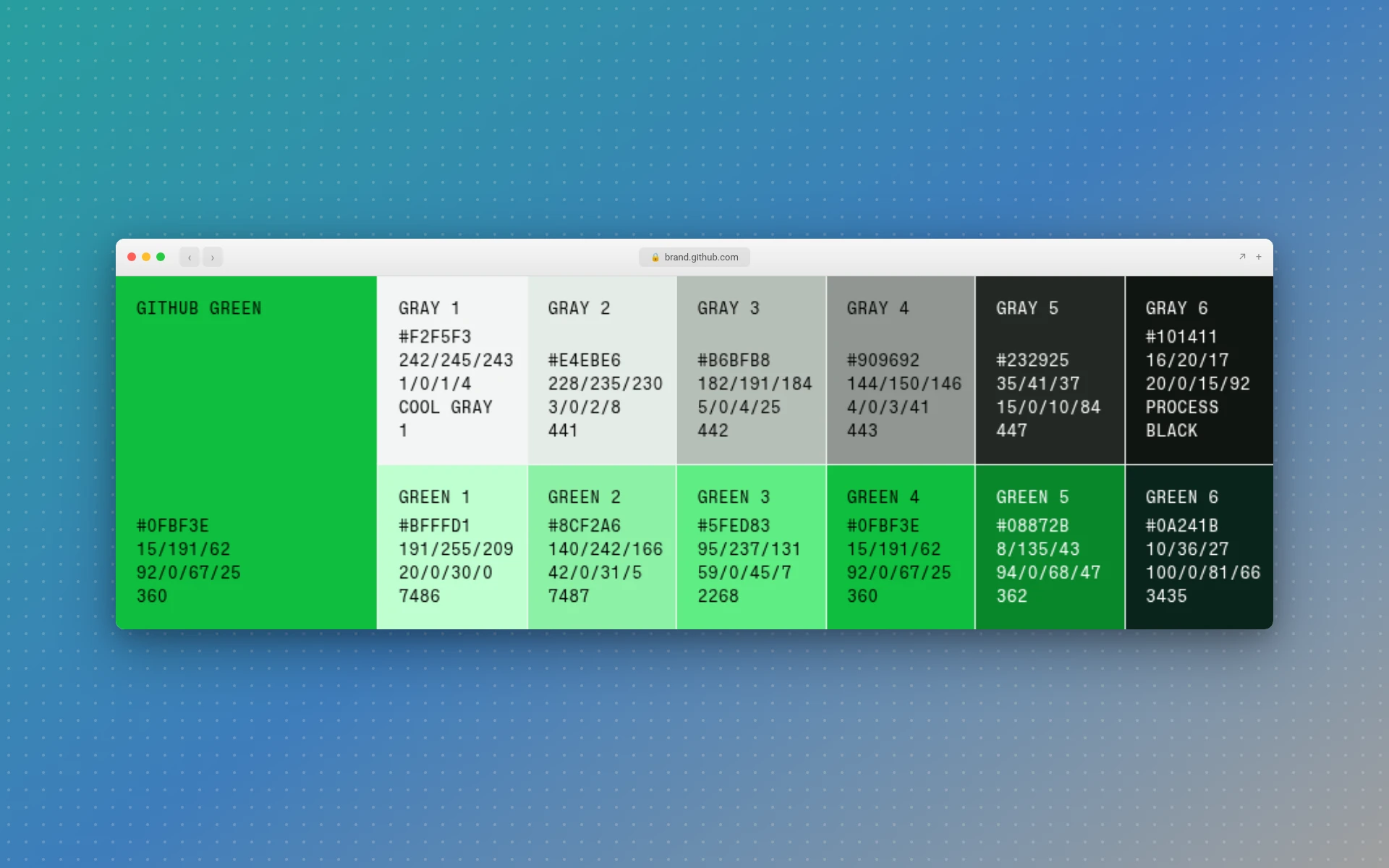
Key colors: GitHub Green #0FBF3E, Green 1 #BFFFD1, Green 5 #08872B, Gray 5 #232925, Gray 1 #F2F5F3
GitHub describes its primary palette as "centering around GitHub Green," yet one of its themes gives that green only 5%. The full split is 80% black or white, 10% neutral, 5% green and 5% purple.
That's the trick to copy. A bright color goes further when it's rare. This green is too light for body text anyway, so it works as a highlight while the grays do the reading.
2. Discord: Two Blues and Black
Key colors: Blurple #5865F2, Light Blurple #E0E3FF, Black #000000
Discord's branding page lists three colors. That's it. If you're a one-person business, this is the shape to steal: a saturated lead, a pale tint of the same hue for backgrounds, and black for everything else.
The name helps too. "Blurple" is easier to remember than a code.
3. Ubuntu: Warm Orange With a Second Personality
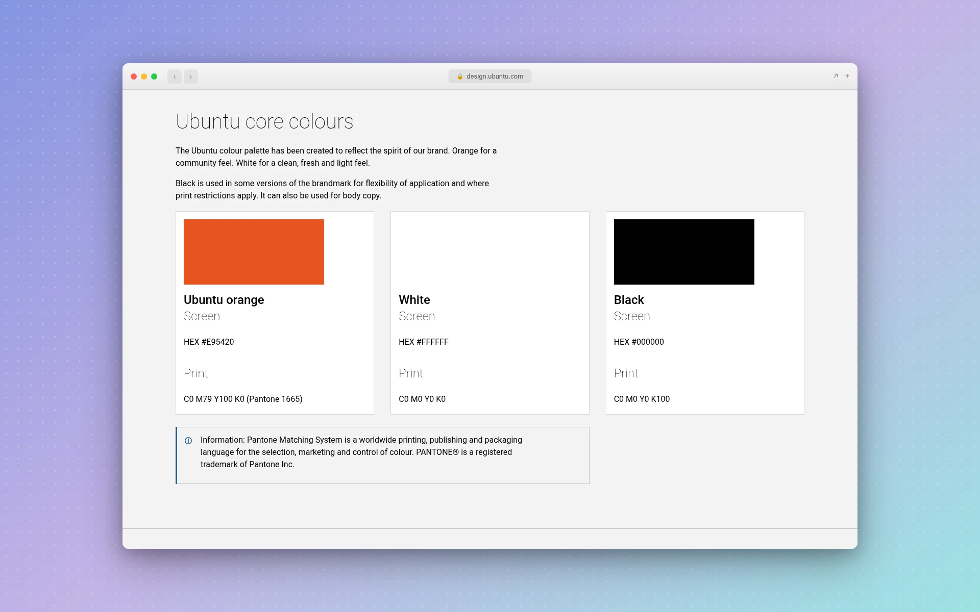
Key colors: Orange #E95420, Light Aubergine #77216F, Mid Aubergine #5E2750, Dark Aubergine #2C001E, Warm Grey #AEA79F
Ubuntu gives each color a reason. Its colour page says "orange for a community feel," then uses the aubergines to shift the audience: "light aubergine for a consumer focus" and "dark aubergine for an enterprise focus."
So one palette speaks to two groups without changing its lead color. If you sell to both shoppers and businesses, you could do the same with a lighter and a darker supporting shade. The warm grey is a nice touch as well, since a plain grey can look cold next to orange.
4. WWF: Black and White First
Key colors: Black #000000, White #FFFFFF, Green #007932, Medium Green #8CC63F, Orange #F07D00
You might expect a conservation charity to lead with green. WWF doesn't. Its brand site says "black and white is our principal colour palette," which matches its panda.
The 13 secondary colors, from Berry to Dark-Brown, take their "inspiration from colours in the natural world." They add variety without competing with the main look. It's a good model if your logo already reads in black and white, as simple minimalist logos tend to.
5. NHS: Every Color Has a Job
Key colors: Blue #005EB8, Text #212B32, Green #007F3B, Red #D5281B, Grey 5 #F0F4F5
The NHS service manual is the most practical page I read. Colors are listed by what they do: blue for links, green for buttons and success messages, red for errors, and a near-black for text.
It even says "only use the variables in the context they're designed for." Most small businesses don't need that much structure. But deciding that your accent means "click here," and nothing else, costs nothing and makes a website easier to use.
6. Wikimedia: Black and White, Plus a Legacy Trio
Key colors: Black #000000, White #FFFFFF, Red #990000, Green #339966, Blue #0063BF
Wikimedia's core palette is white, black and three steps of grey. Red, green and blue sit in a separate "legacy" group, and a creative palette holds strong and light colors for everything else. (The page prints the green and red in shorthand, as 396 and 900.)
I like the honesty of the word "legacy." Palettes change, and older colors can stay on the books as just that.
7. 1% for the Planet: Two Blues and Clear Limits
Key colors: Pacific Blue #1791D1, Atlantic Blue #00578A, Ember #D85935, Juniper #357771, Marigold #F2A61E
This color guide sorts everything into three groups. The blues lead, the secondary colors are "used more sparingly," and the neutrals connect the two. It also advises against pairing secondary colors with each other.
Pacific Blue suits headlines but falls short for small text. Atlantic Blue is the darker sibling that can pick up smaller work.
8. National Wildlife Federation: A Dark Lead That Does Everything
Key colors: Ocean Blue #003057, Fern Green #00AD85, Sky Blue #88DBDF, Forest Green #215732, Sunflower Gold #E8993C
The NWF brand guide has two primaries but picks a winner: "Ocean Blue is the dominant color that pairs well with the other colors." It's dark enough to handle text, headings and backgrounds.
Its groups are unusually clear. Secondary colors, including Pebble Gray #D9D9D6, are "perfect for backgrounds or large areas," and accents like Sunflower Gold are for small doses.
9. Perforce: Bright Colors With a Do-Not List
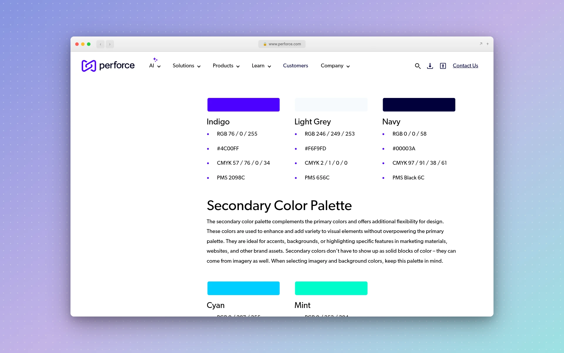
Key colors: Indigo #4C00FF, Navy #00003A, Cyan #00CFFF, Mint #00FCCC, Light Grey #F6F9FD
Perforce, a software company, keeps six colors in three groups, and its guide is blunt: "Always lead with our primary color and use other colors from our palette as accent colors."
The most useful line is a ban: "Never typeset Indigo on Cyan or Indigo on Navy." Writing down the combinations that fail takes a few minutes and stops people repeating them.
10. Blake Morgan: A Law Firm That Skips Navy
Key colors: Purple #340F53, Gold #AF8D41, Beige #F1EFE6, Electric Blue #4D41ED, Sky Blue #6FD1FA
Blake Morgan is a full-service UK law firm, and its 2026 guidelines make a deep purple the primary color for all its communications. Gold and beige keep it formal, while the brighter supporting colors are kept for things like charts and campaigns.
This one's here for anyone in a conservative field. A very dark color can still read as serious, and at 15.7:1 on white it's about as legible as near-black. Two greys, #808285 and #464646, round out the palette.
11. Urban Sports Club: A Lead You Can't Read On White
Key colors: Sophisticated Yellow #F6F0A8, Midnight #2E3742, Grey Dark #8C9BB0, Grey Natural #E7EAEE
Urban Sports Club sells a single membership for sports and wellness across Europe. Its color guide says Sophisticated Yellow "should be the most dominant color in brand communications."
This pale yellow has the lowest number in my table, so you'd never set text in it on a white page. It works as a large background, and the guide pairs it "with white and neutral tones," such as dark Midnight.
What Do These Palettes Have in Common?
All 11 palettes include neutrals, and most of the guides make clear which color leads. Across different industries, the lead color and its contrast change a lot, but the structure barely moves.
- Every one has neutrals. All 11 list black, white or a grey, even where the key colors above don't show it: NWF has Pebble Gray, and Blake Morgan has two greys. None expects its lead color to do the whole job.
- Blue and purple dominate, but not by law. Six of the 11 lead with a blue or a purple. Two lead with black and white, and the other three chose orange, green and yellow. None leads with red.
- Seven of the 11 say which color leads. GitHub, WWF, 1% for the Planet, NWF, Perforce, Blake Morgan and Urban Sports Club all put that hierarchy in words, so nobody has to guess.
- Four leads can't carry body text on white. GitHub, Ubuntu, 1% for the Planet and Urban Sports Club fall below 4.5:1. All four also list a darker color that can.
- Industry doesn't dictate color. The law firm picked purple, the conservation charity picked black and white, and the four software brands run from green to orange.
So I wouldn't start with a chart telling you that blue means trust. Start with what your competitors already use and what your logo has to do, then choose a lead you can live with.
Why Not Just Use a Color-Code Site?
Color-code sites are handy, but they often disagree with each other, so check a brand's own page before trusting a code. For Netflix's red, Brandpalettes gives #D81F26, while Code of Colors gives #E50914.
It's the same story with Starbucks green: Brand Color Code lists #006241, and Design Pieces lists #00704A. One might be older than the other, and I can't tell you which is right from those pages.
That's why you won't find Netflix or Starbucks above. I also left out Mailchimp and Dropbox: both pages name their colors, but neither printed the lead's hex code in the text I read. Their palettes are worth a look all the same, just not as a source of exact codes.
How Do You Create Your Own Brand Color Palette?
To create a brand color palette, pick one lead color, add a dark and a light neutral, then add one accent. Check the contrast, test it on your real materials and write down the codes. Three or four colors will cover most small businesses, and you can add more when a real job calls for it.
Here's the order I'd follow:
- Look at your competitors first. List the colors of your three closest rivals. If they all use navy, you've found an easy way to stand out.
- Get a few options on screen. The free color palette generator builds a palette from any keyword, like "bakery" or "forest," and the random color generator is good for shaking loose an idea you wouldn't have picked.
- Choose the lead and sort the rest. Copy the NWF's groups: one dominant color, a couple of colors for large areas, and an accent for small doses.
- Add a dark and a light neutral. Use a near-black for text and an off-white for backgrounds, like the NHS's
#212B32and#F0F4F5. - Check the contrast. Aim for 4.5:1 for normal text and 3:1 for large text. If your lead falls short, as GitHub's and Ubuntu's do, keep it away from small type.
- Test it on your logo. Print the logo in one color first, since drawing a logo in solid black shows whether the shape works without any help. You'll want a version for dark backgrounds too, which this transparent logo guide explains.
- Write it all down. Shopify's advice is to "use hex codes rather than generic color names." Add a do-not list like Perforce's, plus your rule for which color leads. One page is enough.
Palettes from the generator get a shareable page, so you can send one to whoever you're working with.
If you're hiring a designer to apply those colors to a logo, here's what a logo costs. To see how color works at logo size, look through these logo examples from famous brands.
Frequently Asked Questions
What is a brand color palette?
A brand color palette is the fixed set of colors an organization uses everywhere, from its logo to its invoices. It usually includes a lead color, one or more supporting or accent colors, and neutrals for text and backgrounds. Each color gets exact codes, so it looks the same whoever applies it.
How many colors should a brand color palette have?
Three to five is plenty for most businesses. Discord's public page lists three, while 1% for the Planet lists 13 but keeps a short group of primaries at the front. Size matters less than knowing which color leads. There's more in this guide on how many colors a brand should have.
What is the best color palette for a small business?
There isn't one best palette, and my 11 examples show that plainly. A useful small-business shape is one lead color, one accent, a near-black and an off-white. Choose a lead your closest competitors aren't using. These logo ideas for small business show how brands that started small put that into practice.
Can I copy a famous brand's color palette?
You can study one and use its structure freely. I wouldn't copy the exact colors of a brand in your own field, because customers could confuse the two, and that's also where legal trouble is most likely. If yours ends up close to a competitor's, ask a trademark attorney before you print anything.
Where can I find a brand's official hex codes?
Start with the brand's own site. Search for its name with "brand guidelines" or "brand assets," then look for a color page. Many companies publish one, though some, like Mailchimp, showed names without codes in the text I read. Treat color-code sites as a rough guide, since they can disagree.
Where to Go From Here
A law firm's purple and a sports membership's pale yellow look nothing alike, but both start by naming the one color in charge. Pick the palette closest to your own business and borrow its structure, then try a keyword in the color palette generator to see your own first set.
Once you've got colors, you'll need something to put them on. If you'd like to see a few logo directions quickly, LogoGen is one option: you describe your company, pick a style and colors, and it generates logos, typically in under 10 seconds. You could also browse the logo types first.