Look up cleaning company logo ideas and you'll see the same handful of templates over and over: a broom, a mop bucket, a spray bottle, a little house with a sparkle on the roof, some soap bubbles. They say "cleaning" in half a second. They also make you look exactly like the three other cleaners on the same flyer board.
So I went looking at the companies that actually grew big. On November 10, 2026, I lined up the official logos of nine well-known cleaning brands, from maid services like Molly Maid and Merry Maids to carpet cleaners like Stanley Steemer and Chem-Dry, and noted what each one is built from. None of the nine uses a broom, a mop, a bucket or a spray bottle. All nine spell out the company name, and four of them date back to the same year, 1979.
If you want the short version, skip to the table of ideas by type of cleaning business.
What Makes a Good Cleaning Company Logo?
A good cleaning company logo is a readable name in one or two fresh colors, with at most one simple symbol that hints at care or a clean result, like a flower or a sparkle. It has to look trustworthy on a polo shirt and a car door, because customers let you into their homes.
That last part is what makes cleaning different from most trades. A logo for cleaning services has three jobs:
- The front-door test. Would you open the door to a stranger wearing it on a polo shirt?
- The car-magnet test. Can a neighbor read it from the sidewalk as you park?
- The one-color test. Does it still work printed in black on an invoice, or embroidered in white on a navy shirt?
A clear name passes all three. A detailed drawing of a maid with a feather duster usually fails the third one.
9 Cleaning Company Logos at a Glance
Here are the nine official logos I looked at, in the order of the table below.
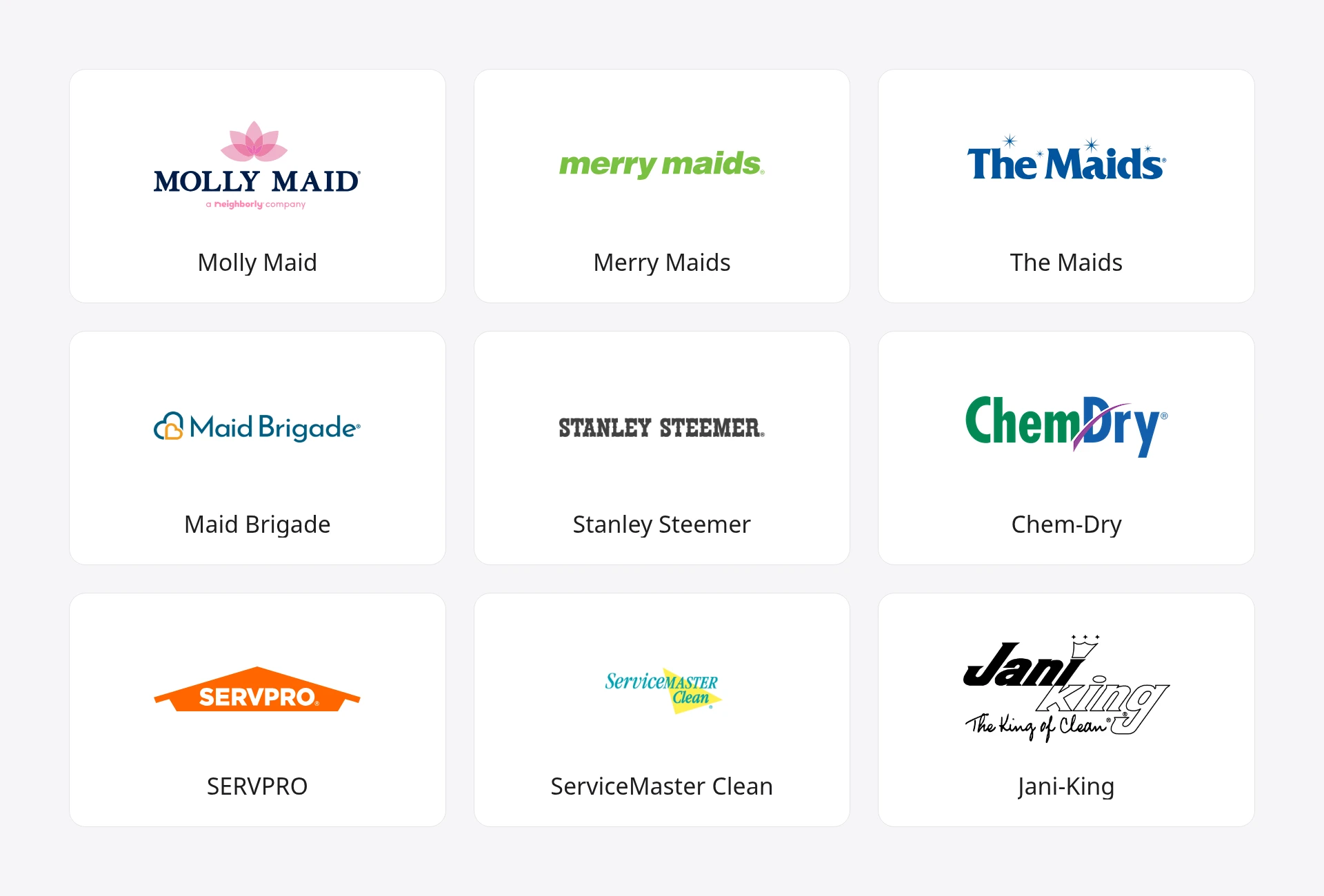
| Brand | What the logo is built from | Colors | Founded |
|---|---|---|---|
| Molly Maid | Name in serif capitals under a lotus flower | Navy, pink | 1979 |
| Merry Maids | Name only, lowercase and slanted | Green | 1979 |
| The Maids | Name in bold type with small sparkles | Blue | 1979 |
| Maid Brigade | Name plus two overlapping outlined hearts | Blue, orange | 1979 or earlier |
| Stanley Steemer | Name only, in heavy slab capitals | Black | 1947 |
| Chem-Dry | Two-color name with a swoosh through the D | Green, blue, purple | 1977 |
| SERVPRO | Name inside a roof shape | Orange, white | 1967 |
| ServiceMaster Clean | Slanted name over a yellow burst | Teal, yellow | 1952 (brand) |
| Jani-King | Name with a crown, plus "The King of Clean" | Black | 1969 |
A note on method: the "built from" and "colors" columns are what I saw in each company's current official logo. The founding years come from the linked sources. Maid Brigade's own page says "since 1979" without giving a founding date, and ServiceMaster Clean's year is when the brand was set up inside ServiceMaster, which dates to 1929.
The 9 Logos, One by One
1. Molly Maid: A Soft Symbol Above a Formal Name
Molly Maid sets its name in dark navy serif capitals and puts a pink lotus flower on top. The pairing does two things at once: the capitals look established, and the flower keeps it gentle.
The company was founded in 1979 in Mississauga, Canada, by Adrienne and Chris Stringer, and Wikipedia says it was named after Molly Brown from the 1964 film The Unsinkable Molly Brown. Its US story began in 1984, when "entrepreneur David McKinnon brought Molly Maid from Canada to Ann Arbor, Michigan," per Molly Maid's about page.
Borrow it if: you want to look both dependable and warm. One soft symbol over plain, solid type is a balance plenty of house cleaners could use.
2. Merry Maids: Let the Name Be the Logo
Merry Maids uses no symbol at all. It's the name in heavy, slanted, lowercase green letters. The lowercase keeps it friendly, and the slant gives it a bit of speed.
According to Wikipedia, Merry Maids was founded in Omaha, Nebraska, in 1979 "by Dallen Peterson and his family," and ServiceMaster bought it in 1988.
Borrow it if: your name already sounds like a cleaning business. A name that does the explaining doesn't need a broom next to it. The wordmark logos guide covers how to make a type-only logo feel like yours.
3. The Maids: Sparkles, Used Sparingly
The Maids sets its name in bold blue type and adds a few small four-point sparkles around it. It's the closest any of the nine gets to the usual "clean" icon, and it's restrained: tiny stars, not a cartoon shine.
The company's own history says Daniel J. Bishop "founded The Maids in his hometown of Omaha, Nebraska," in 1979, and that it developed a "22-Step Cleaning Process." So two of the nine brands here started in the same city in the same year.
Borrow it if: you like the sparkle idea. Keep it small, put it around the name, and use one color for both.
4. Maid Brigade: A Symbol That Means Care
Maid Brigade pairs its name in blue with two overlapping outlined hearts, one blue and one orange. The hearts say "we look after your home" without showing a single cleaning tool.
The company's about page says "Since 1979, Maid Brigade has led the house cleaning industry by constantly pursuing better, safer cleaning solutions."
Borrow it if: you want your logo to talk about how customers feel, not what you carry. A simple heart can do that.
5. Stanley Steemer: Heavy Type and a Color You Can Own
Stanley Steemer's logo is the name in heavy slab capitals. That's it. The brand's bigger visual asset sits elsewhere: Wikipedia notes that a Springfield, Ohio, franchise owner "came up with the company's distinctive yellow and black vans."
Jack Bates founded the business in Columbus, Ohio, in 1947 as the Jack Bates Carpet Cleaning Company, and it was incorporated as Stanley Steemer International in 1972, per the same page.
Borrow it if: you'll spend most of your time on the road. A plain, heavy logo plus one loud vehicle color gets you seen in every driveway you park in.
6. Chem-Dry: Split the Name Into Two Colors
Chem-Dry sets "Chem" in green and "Dry" in blue, with a purple swoosh cutting through the D. The two colors make the two halves of the name easy to read, even without the hyphen.
Wikipedia says the company was founded in 1977 in California, began franchising in 1978, and that "the name stands for CHEMISTRY-DRY."
Borrow it if: your business name is two words joined together. Coloring each part differently is a cheap way to make a compound name readable.
7. SERVPRO: A Roof, Not a House
SERVPRO knocks its name out in white from an orange shape that reads as a roofline. It's the only logo of the nine with a building in it, and even then it's a flat, simple roof, not a drawing of a house.
The business began in 1967 as "a painting business owned by Ted and Doris Isaacson in Sacramento, California," and the couple "sold their first franchise in 1969," according to SERVPRO's history page. Its homepage still leans on the slogan "Like it never even happened."
Borrow it if: you do cleanup or restoration work on whole properties. One bold shape that holds the name works well on a van door.
8. ServiceMaster Clean: An Older Look That Still Works
ServiceMaster Clean sets its name in slanted teal type over a bright yellow burst. It has the most "retro" feel of the nine, which makes sense given how old the parent company is.
Wikipedia says ServiceMaster was founded in 1929 by Marion E. Wade "as a moth-proofing company in Chicago, Illinois," and lists "ServiceMaster Clean (established 1952): Janitorial and carpet cleaning."
Borrow it if: you serve offices and businesses and want to look like you've been around a while. A simple burst of color behind the name gives energy without adding a picture.
9. Jani-King: Build the Logo Around a Pun
Jani-King's logo is the most playful here: a heavy black italic "Jani," an outlined "king" with a small crown, and the line "The King of Clean" underneath. The name is the joke, and the crown is the only symbol it needs.
James Cavanaugh, Jr., founded the company in Oklahoma City in 1969, according to Wikipedia.
Borrow it if: your name has a pun or a word you can draw. A crown for "king" or a bee for "busy" beats a generic broom every time.
What the 9 Logos Have in Common
Looking at the nine official logos side by side, a few patterns stand out:
- All nine spell out the name. Two (Merry Maids and Stanley Steemer) are type only. The other seven add one element at most: a flower, sparkles, hearts, a swoosh, a roof, a burst of color or a crown.
- None shows a cleaning tool. No brooms, mops, buckets, vacuum cleaners, spray bottles or soap bubbles. The symbols they do use point to a feeling (care, a fresh result) or to the name itself.
- Blue and green lead the colors. Blue, navy or teal shows up in five of the nine, and green in two. The standouts go the other way: SERVPRO's orange and Molly Maid's pink.
- 1979 was a busy year for maids. Molly Maid, Merry Maids, The Maids and Maid Brigade all date back to 1979, and two of them started in Omaha. Four brands with "maid" in the name all chose not to draw one.
That second point matters most for a small cleaning business. Template sites push brooms and bubbles because those pictures say "cleaning" fast. The biggest names show that a clear name and one small idea are enough. For more on how a symbol differs from a full logo, see the explainer on what a logo mark is, or compare these with logo examples from famous brands outside cleaning.
Cleaning Logo Ideas by Type of Business
Here's how I'd match the ideas above to different kinds of cleaning business. Treat them as starting points.
| Type of cleaning business | Logo ideas that usually fit | Why |
|---|---|---|
| House cleaning or maid service | A soft symbol over the name (Molly Maid), hearts (Maid Brigade) | Customers are inviting you into their home, so warmth wins |
| Solo cleaner or small team | Name only, friendly lowercase (Merry Maids) | Cheap to print, and it grows with you |
| Carpet and upholstery cleaning | Heavy name plus a vehicle color (Stanley Steemer), two-color name (Chem-Dry) | You're seen mostly on vans and in driveways |
| Restoration and cleanup | One bold shape holding the name (SERVPRO) | Has to read on signs during an emergency |
| Commercial or janitorial | Slanted name over a color burst (ServiceMaster Clean), a pun (Jani-King) | Looks established on bids and building notices |
| Eco or green cleaning | A leaf or a drop beside the name, in one green | One plain symbol says it without greenwashing clichés |
| Window or pressure washing | A sparkle or a simple glint (The Maids) | The result you sell is shine, so show only that |
If you run a small trade business, the logo ideas for small business post covers seven more starting points from brands that began small, and the construction logo ideas post shows the same name-first approach for contractors.
What Colors Work Best for a Cleaning Logo?
Blue and green are the safest colors for a cleaning logo, and they're what most of the big brands on this page chose. To me, blue suggests water and hygiene, and green suggests fresh or eco-friendly. Pair one of them with white space and at most one accent, and make sure the logo still works in plain black.
Among the nine logos, five use blue, navy or teal, and two use green. The two that break the pattern stand out for it: SERVPRO's orange is hard to miss on a van, and Molly Maid's pink feels personal for a home service.
Think about where your logo will live. If it's mostly on shirts and car magnets, a strong blue or green prints well. If your area is crowded with blue cleaners, a warmer color can help you get noticed. For help deciding how many colors to use, see how many colors a brand should have, or try the color palette generator for combinations.
What Symbols Work for a Cleaning Business Logo?
The best symbols for a cleaning business logo are simple and point to a result or a feeling, such as a sparkle, a leaf, a heart, a flower or a roofline. Avoid detailed tools like mops and spray bottles, which crowd the design and look like every template.
Here's what the nine brands used instead of tools:
- A flower (Molly Maid) for a soft, home-friendly feel.
- Sparkles (The Maids) for a fresh, finished result.
- Hearts (Maid Brigade) for care.
- A roof (SERVPRO) for whole properties.
- A crown (Jani-King) because of the name.
If you do use a symbol, keep it to one, and test it at the size of a social media avatar. The minimalist logos guide shows how to strip a symbol down until it reads at small sizes.
How to Make Your Own Cleaning Business Logo
The quickest way to a cleaning business logo is to settle your name, set it in clean, friendly type, then decide whether it needs one extra element, such as a soft symbol.
Here's the process I'd follow:
- Lock in the name. A logo built around a name you later change is wasted money, and depending on how much your logo costs, that adds up. If you're still choosing, try the cleaning company name generator.
- Pick one idea from the nine. Name only, a soft symbol, sparkles, a color split, a shape or a pun. Use the table above to narrow it down.
- Sketch it on paper. Ten quick versions in ten minutes. The guide on how to draw a logo walks you from sketch to a clean vector.
- Run the front-door, car-magnet and one-color tests. Shrink it to the size of a polo shirt badge, then print it in black only. If it blurs, simplify.
- Add color last. Start in black, then add one main color and at most one accent.
- Check it isn't taken. The US Patent and Trademark Office says a trademark "can be any word, phrase, symbol, design, or a combination of these things that identifies your goods or services" (USPTO). The guide on how to trademark a logo covers the search.
- Export the files you'll need. A vector for car magnets and shirts, and a version with a transparent background for your website and quotes. The transparent logo guide covers that step.
Frequently Asked Questions
Should a cleaning logo include a broom or a mop?
It doesn't need to, and none of the nine logos on this page does. Brooms, mops and spray bottles are so common in cleaning templates that they make you look like everyone else. A clear name with one small symbol, like a heart or a sparkle, is easier to remember and easier to print.
What should a cleaning company logo include?
At minimum, your business name in clear, friendly type. Many strong cleaning logos add one more element: a soft symbol like Molly Maid's lotus, a shape like SERVPRO's roof or a short line like Jani-King's "The King of Clean." Leave phone numbers and service lists for the flyer, not the logo.
What is a good house cleaning logo idea?
A good house cleaning logo puts warmth first, because you work inside people's homes. Try your name in friendly type with one soft symbol above or beside it, the way Molly Maid sets a pink lotus over its capitals and Maid Brigade puts two outlined hearts next to its name. Neither shows a cleaning tool.
How much does a cleaning company logo cost?
It depends on who makes it. You can sketch one yourself for the cost of your time, use a logo maker, or hire a freelancer or agency for a custom design. Prices vary widely, and the breakdown of what a logo costs compares the main options.
Can I use blue and green like the big cleaning brands?
Yes. Colors on their own are widely shared in cleaning, and five of the nine logos here use blue, navy or teal. What you shouldn't do is copy a brand's symbol, lettering or overall look, like SERVPRO's orange roof. Search the USPTO's records before you pay for uniforms and car wraps.
Where to Go From Here
The nine cleaning company logos on this page come down to one idea: let a clear name do the work, then add one small symbol that says care or a clean result. Skip the broom, pick one or two fresh colors, and test it on a shirt and a car door.
If you'd like to see a few directions before you sketch, LogoGen is one option: you describe your business, pick a style and colors, and it generates logo options, typically in under 10 seconds. Or go back to the nine examples above and pick the one idea that fits your business.